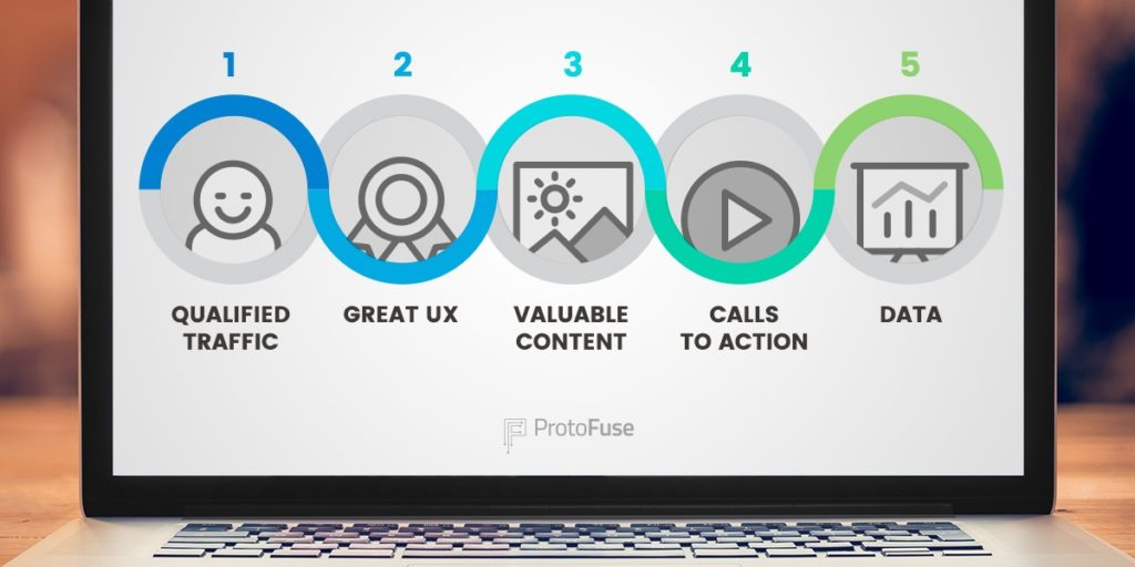
CTA Best Practices: Want better Conversion? Follow the 4 C’s
Updated last on:
March 2, 2023
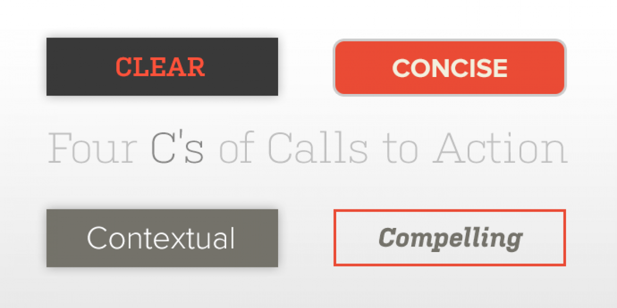
Improving website conversion begins with your website's call to action (CTA). Well designed CTAs follow the Four C’s: Clear, Concise, Contextual, & Compelling.

by Eric Sharp
TOPICS:
You have the traffic, but are you maximizing it?
Are you taking advantage of your website traffic?
You’ve targeted your ideal customer and they’ve arrived on your website, ready to engage with your brand and learn more about how you can help them solve their problems.
Have you specifically planned on the types of actions you’re trying to inspire? Maybe it’s a purchase, download, or filling out a form? Inspiring action (aka conversion) starts with your website’s call to action.
Well designed calls to action follow the Four C’s
- Clear
- Concise
- Contextual
- Compelling
What is a Website Call to Action?
Let’s start with the basics.
A call to action, or CTA, is an element on a website (typically a button) that tries to encourage a specific action from a user.
A well designed call to action will either:
- convert an anonymous user into a known contact (e.g. Name, Email)
- steer a user to a specific page that’s crucial in your sales cycle
Some popular website CTAs
- SIGN UP FOR OUR (Newsletter, Blog Digest)
- GET OUR (Guide, White Paper)
- BUY (Today, Now)
- DOWNLOAD (Webinar, Ebook)
- FREE (Consultation, Demo)
- CONTACT (Us, Our Team)
Following the “Four C’s”

If you’re hunting for a practical guide to evaluate your website’s calls to action, borrow and improvise on a commonly know one from the diamond industry — the “Four C’s”.
Knowing the Cut, Clarity, Color and Carat Weight of a diamond helps consumers further their understanding and maximize their investment.
In similar fashion, applying these modified Four C’s to your website’s CTA will improve user understanding and help your company maximize its investment.
Defining the Four C’s
1. CLEAR
The average person visits about 10 different websites every day (~100 per month) with each visit lasting less than a minute. Though your website’s data could vary, the point here is that user attention and time are finite. Your website will immediately compete for both because digital overload and fatigue is a reality for all people.
Your CTA should be clear about the action you’re trying encourage. Don’t make them hunt for it, but don’t let it smother their experience.
A clear CTA says “Hey, I’m right here when you’re ready.” Not, “LOOK AT ME WOOO-HOOO!”
2. CONCISE
Getting cute, wordy or overly creative with your call to action will disrupt what I call the “natural flow of conversion”. The copy needs to be concise and use specific language.
By overthinking, you risk disrupting a user’s decision-making process that should flow naturally.


3. CONTEXTUAL
Ensuring your website call to action has context is twofold.
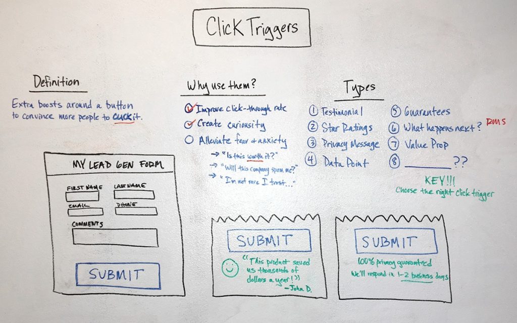
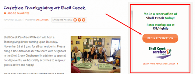
First, they should use what Jared Spool calls trigger words (words or phrases that “trigger” the user into acting). Secondly, your website should have more than one CTA so it appeals to every stage of the sales cycle. What call to action goes on which page is the context you’ll want to map out.
4. COMPELLING
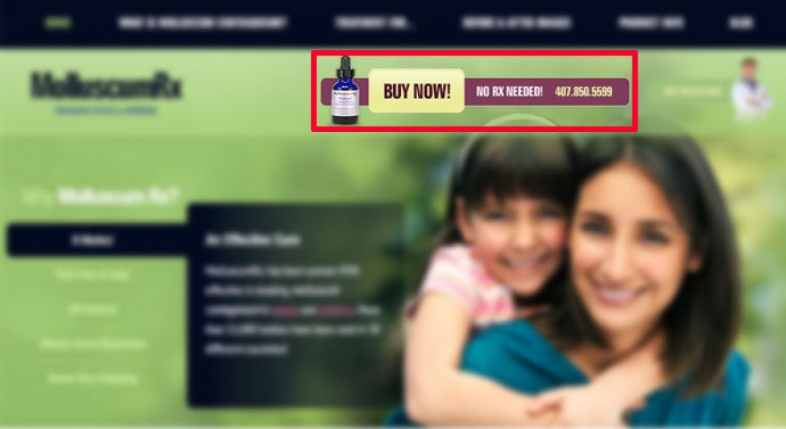
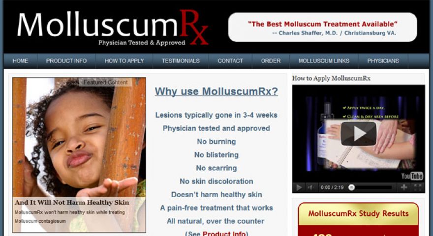
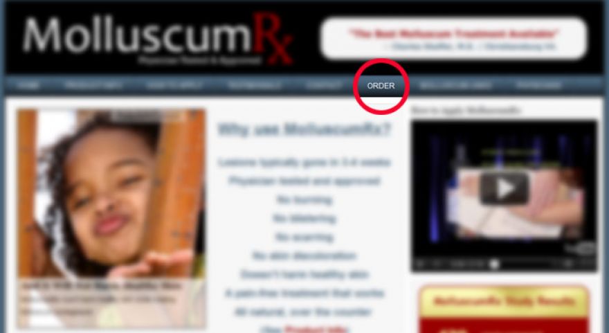
Design is an “exercise in creating or suggesting contrasts”, per Andy Rutledge, and a compelling call to action utilizes contrast to create focus, space and dominance — principles of visual design.
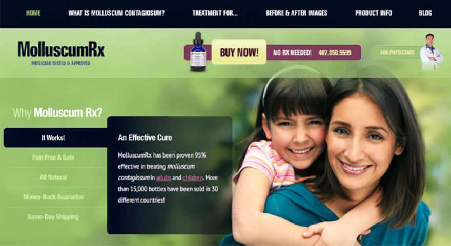
Before hiring us, our client MolluscumRx was a classic example of a website missing a compelling CTA.
Will it make a difference?
Applying “C” rules to calls to action is certainly not an unchartered topic. I’ve seen Three C’s here — insightful source that inspired my Four C’s.
I think our industry seeks to theorize best practices for calls to action because we can see firsthand how it impacts a company’s bottom line.
The increasingly number of tools and services that offer A/B Testing and Conversion Optimization are proof that it deserves a substantial notch in the user experience design tool belt.
Ensuring your calls to action are Clear, Concise, Contextual and Compelling will not only make a difference, they could be a complete game changer for your business in the sales, leads and new contacts they could generate.
Need website help?

We're all about websites — especially websites that are loved by people and Google.
Since 2001, we've been helping clients nationwide turnaround their outdated and under-performing websites.

"Our website is generating quality leads every week thanks to their website consulting."
Steve L.
Cactus Technologies
Hey, you made it!
There is gobs of information available today — I'm honored you found this article interesting enough to make it here. I hope this insight leads you to a better-performing website!


About the Author
Eric Sharp is the founder of ProtoFuse and has been in the website trenches since 1999 — right before the dot-com boom redefined the website landscape. Since then, he's accumulated 25 years of digital marketing experience and prides himself on creating websites "Loved by people and Google". Outside of websites, it's all about fam time with his wife and 3 kids. He enjoys CrossFit, cooking steak on his cast iron skillet, collecting Jordan sports cards, and Daaa Bears.

