The ABCs of a Conversion Website
Updated last on:
April 3, 2022
To understand the dynamic components of an actionable, conversion-focused website, let’s take a classroom approach and get back to the basics with the ABCs.

by Eric Sharp
TOPICS:
There is growing chatter around website conversion the last few years.
Conversion optimization, conversion rate, conversion tracking — is this new vernacular proof that websites are becoming more scientific?
The short answer is, absolutely!
The science component of a website can help your company shift its focus from aesthetics to measurable action. Action creates engagement, piles up data for future improvement, and could render dollars. Without user action, you’re just left with a “pretty” website (that could win trivial design awards, but won’t make an impact).
To understand the dynamic components of an actionable, conversion-focused website, let’s take a classroom approach and get back to the basics. Here are the ABCs of a conversion website.
A — Analytics
What’s to measure without data? Where’s the data without the tools? Google Analytics is a no-brainer, but heatmaps (CrazyEgg), Inbound Marketing reports (Moz), and landing page optimization (Unbounce) are excellent tools of the trade that will help you create and measure data.
B — Buying Cycle
Inspiring action at every stage of the buying cycle is not only critical for conversion, but it’s one of the five defining characteristics of a lead generation website. A conversion website thinks about all three phases: Awareness, Evaluation, Purchase.
C — Call to Action
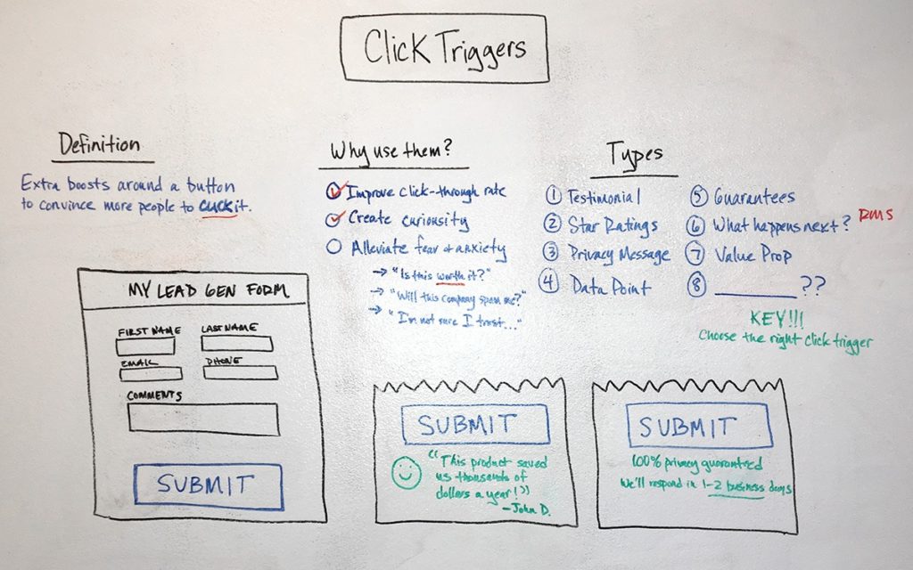
Without properly designed calls to action, it’s almost impossible to obtain a conversion. Make sure your CTAs follow best practices.
D — Data-driven
It’s about time that web marketers back their theories with data, and I’m pointing the finger at myself here!
- “Your visitors won’t engage this content.”
- “This blue button will convert more than a red button.”
- “Step 3 of this checkout process sucks!” (illustrating a point here, people)
Data-driven design is utilizing data (both qualitative and quantitative) to make better decisions about design and content.
E — Engagement
Users won’t convert without being diligently engaged. Your website’s hierarchy, navigation, content, and calls to action play a major role in their interactions.
F — Forms
Forms can turn anonymous visitors into known contacts. If your website is solely pushing an email address (e.g. “Reach out to us by sending an email to contact@website.com”), you’re missing out. Forms collect information faster, have metrics tied to them, and provide a smoother experience.
G — Goals
Without goals, you have a house without a foundation. Goals and objectives are the bedrock to making all critical decisions — especially about what types of macro and micro conversions are needed to reach those goals. Goal setting should happen during a website’s strategy.
H — Hierarchy
Unintuitive menus and odd jargon will create more problems than they’ll solve with your navigation. Clear website hierarchy can establish a trust that will pay dividends once a conversion element presents itself.
I — Interaction (as minimal as possible)
Usable sites minimize the interaction cost required to attain a variety of user goals. These interactions include reading, scrolling, looking, searching and in particular, clicking and typing.
A conversion website minimizes the interaction cost (in other words, makes it easy) for users to click call to action buttons and type information into forms. There’s an inverse correlation between effort and conversion rate.
J — Juxtaposition
For those non-designers, juxtaposition is when two things placed close together have a contrasting effect.
High converting websites have mastered this art when it comes to their calls to action and content. They’re strategically placed close to each other, but seen as separate elements.
K — KPI
A website’s KPIs (Key Performance Indicators) could be a financial or non-financial metric used to help your organization evaluate its website’s conversions. A goal establishes the what, the KPI reports on its status.
L — Lean
Not in content or functionality, but in overall weight (which impacts load time). A Nieslen Norman Group study proved that a snappy user experience beats a glamorous one. Speed matters.
If I were a gambling man, I’d bet that a website’s leanness and overall speed is the most overlooked element to a conversion website.
M — Measurement
Don’t mistake measurement for casually looking at analytics, this is about understanding what the data is telling you. Proper measurement can diagnose what’s working and what’s not.
N — Newness (of content)
When’s the last time you filled out a form, made a purchase, or decided to call the 800 number on an unfamiliar website that didn’t have new content?
An active blog, social presence, recent reviews, and even a correct copyright year can build trust. And trust is fundamental for conversion.
O — Optimized (for conversion)
Not search engine optimized (though critical), but conversion optimized. Compelling copy, clear messaging, well positioned imagery, proper contrast and an understanding of psychology are some of the paintbrushes used by smart conversion optimizers today.
P — Positioning
Again, I’m not speaking search engine lingo, I’m talking about a company’s positioning. The folks at NewFangled define positioning as “what you do,” “who you do it for,” and “what the benefit is to them.”
Sharp positioning quickly explains a company’s products and services, their ideal customer, and what problems they solve.
Q — Qualified Traffic
After avoiding search engine topics with the letters ‘O’ and ‘P’, here’s a critical one as it pertains to a conversion website: qualified search engine traffic.
If your website exclusively sells work boots, and you get traffic for cowboy boots, how likely do you think that traffic will buy or sign up for email deals?
Qualified traffic = higher conversion rate
R — Relevance (in content)
If you’re not serving up the appropriate content, creating conversion should be the least of your concerns. A high bounce rate (90%+), low page views (1-2 per visit), and short visits (under 5 seconds) should sound your “relevancy alarm”.
Engaged content and users taking action is proof a website is relevant to its audience.
S — Systematic
Conversion websites have the ability to capture, organize, send and automate the influx of data with multiple systems including; CMS (content management system), CRM (customer relationship manager), email marketing tool (we love MailChimp) and maybe even a marketing automation tool (Act-on is great for SMBs).
Systems help everyone do their job better and faster.
T — Testing (to improve conversion rate)
Conversion testing encapsulates a wide range of activities from split testing a call to action button’s copy, to improving a checkout process. Services like Google Analytic’s Experiments (free), Userlytics, SessionCam, and Eyequant can help implement and measure these tests.
Remember the purpose of testing; prove a hypothesis, not add more noise.
U — User Research
Achieving a conversion is difficult in itself, without user research, it’s darn near impossible. The creation of web design personas defines your user’s behaviors and motivators — critical ingredients to inspiring conversion.
V — Value Proposition
Does your website display a clear statement of the tangible results a customer/client gets from using your products or services? Conversion websites nail their value proposition because they understand its influence.
W — Wide Funnel
How in depth is your newsletter sign up, contact form or webinar registration? If you’re asking for too much information, you might be killing your conversion rate.
A conversion website keeps the top of its sales funnel extremely wide. They ask for minimal information on their email newsletter signup, keep a few contact forms short and sweet, and keenly evaluate just how important those “required” fields are.
X — X Factor
Smart marketers can find an element specific to an industry or audience and capitalize on it. In a highly competitive market, the X factor could be the conversion that helps a company outperform its competitor.
Designing a landing page around one specific conversion, or distributing a well-crafted piece of content, are great tactics in finding a company’s X factor.
Y — Yield
Conversion can and should impact your bottom line. Sometimes it’s immediate (e.g. sales), other times it’s a slow drip (e.g. free webinar sign up) but it’s always 100% tangible.
A conversion website will yield more emails, leads, sales and inquiries than a static (aka “brochure”) website.
Z — Zest
What’s that hidden quality of websites that make it easy to give up your email address or fill out that form? It’s almost as if you can feel it when a website has it (and doesn’t have it).
I believe conversion takes a little zest. It can break down skepticism with charm, create engagement through entertainment, and help a website become more enjoyable to use.
Homework…Class?…Anyone?…Bueller?
What’s the ABCs without a little homework?
As you continue educating yourself on conversion, I encourage you to grasp the fundamentals first. Dissect each of the 26 characteristics above and figure out ways to incorporate them into your own vocabulary first before applying to your website.
Action without thought is impulsiveness.
Thanks, Greg Githens.
Need website help?

We're all about websites — especially websites that are loved by people and Google.
Since 2001, we've been helping clients nationwide turnaround their outdated and under-performing websites.

"Our website is generating quality leads every week thanks to their website consulting."
Steve L.
Cactus Technologies
Hey, you made it!
There is gobs of information available today — I'm honored you found this article interesting enough to make it here. I hope this insight leads you to a better-performing website!


About the Author
Eric Sharp is the founder of ProtoFuse and has been in the website trenches since 1999 — right before the dot-com boom redefined the website landscape. Since then, he's accumulated 25 years of digital marketing experience and prides himself on creating websites "Loved by people and Google". Outside of websites, it's all about fam time with his wife and 3 kids. He enjoys CrossFit, cooking steak on his cast iron skillet, collecting Jordan sports cards, and Daaa Bears.


