Is the Design in Website Design about Art?
Updated last on:
May 16, 2022
Art can be breathtaking and leave us with warm fuzzies. Can the same be said about web design? Learn why the process and challenges of designing a website can be artful, but it isn’t about art.

by Eric Sharp
TOPICS:
Quick Summary
A website's aesthetics play a role in a website, and the reason why visual design is one of the five total competencies of user experience design. However, personal design preferences and warm fuzzies have no relevance to a website's overall success. This is a difficult conversation for most because design is emotional and personal — it's challenging to avoid bias. Websites are not to be treated like a piece of art hanging in your living room because people need to use a website (clicking, tapping, reading, scrolling, searching). These interactions exist to solve a business problem. When a website is treated like art, consequences follow such as poor goals, research, structure, usability, content, and more. Simply put, websites can be artful and beautiful. But, a web designer creates something to use, and an artist creates something to appreciate.
When you hear the word Art, what comes to mind?
Breathtaking visuals? Personal interpretation? A search for meaning that leads to that desirable human sensation we call a warm fuzzy?
What about “Website Design”? Does the design in website design conjure up a similar emotional response?
To the people and companies that own results-driven websites, “Absolutely not”. If you’re thinking “Yes”, or “Maybe” — this blog is for you.
Don’t get me wrong. A website’s aesthetics plays a big role in a website. However, personal artistic tastes and warm fuzzies have no relevance when designing a website.
Web design is NOT Art.
And here’s why.
Design is polarizing because it’s sometimes misunderstood
In my 15 years of helping clients design websites, I’ve never seen another word have such an impact on a working relationship.
Design is emotional. Design is personal. And that’s OK — when design is understood.
I believe web design is often misunderstood because it’s confused as Art. Rather than a meticulous process of calculated micro decisions backed by qualitative and quantitative data, it’s sometimes viewed as though it were an acrylic painting hanging over a couch.
Have you ever interacted with a traditional painting?
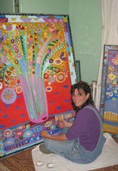
Though this artist’s photograph (below) reminds me of my favorite city Chicago, and I’m quite fond of his creativity, I never take it off my home office wall to physically interact with it.
Bare with me. I realize this is an obscure example, but it’ll help illustrate my position.
Think of any piece of Art hanging in the place you call home. When’s the last time you took it off the nail, touched it, and expected feedback to help solve a problem?
Never, right? (Please say never.)
Yes, good Art is powerful and motivational. But, Art — for the average person — hangs, decorates and beautifies a home, apartment or office.
Though there’s plenty of mental interaction (“Gosh, this painting reminds me of…”), there’s no physical interaction (“When I touch here, I’ll expect…”).
Now we’re getting to the core difference between Art and web design.
Interaction.
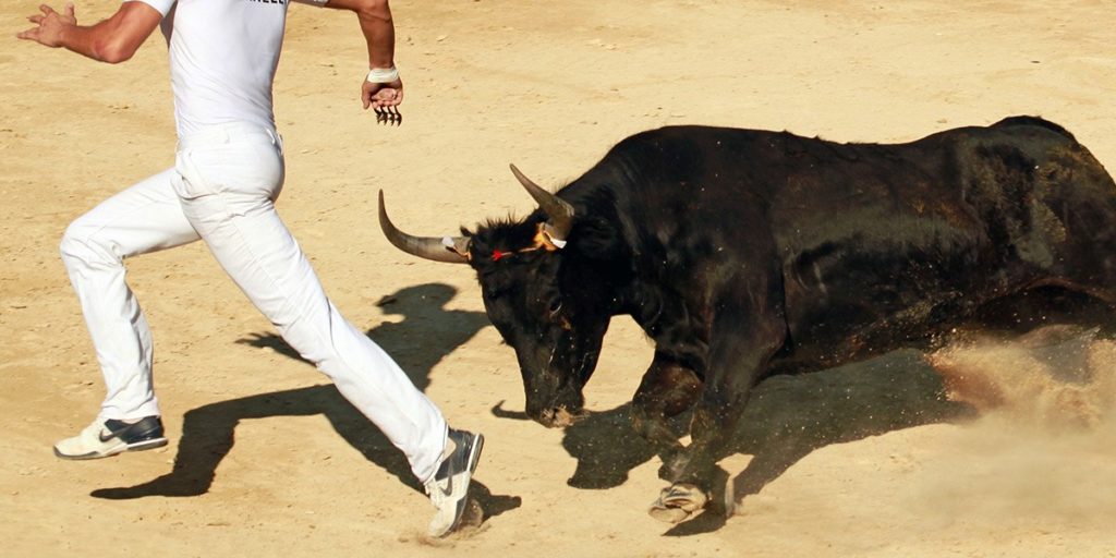
When people start interacting with computers, things get messy.
Web design is not decoration because people need to use a website
Art evokes “Do you like it?” type of questions, but Web Design doesn’t get off that easy. Websites exist to solve communication, marketing, and sales problems.
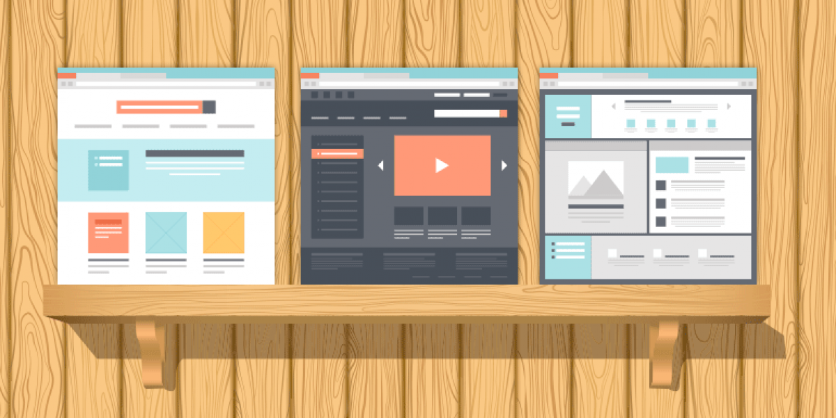
A website comes with the fundamental understanding that people will use it. For a website to be a website, it requires human interactions such as:
- searching
- clicking
- tapping
- reading
- scrolling
When people start interacting with computers, things get messy, and subsequently requires the principles of interaction design (IXd) (e.g. goals, usability, feedback, learnability).
Furthermore, these interactions exist to solve a problem ultimately. We can precisely measure if web design does its job. With Art, we can’t because of its subjectiveness.
Joshua Porter’s Design is Not Art, Redux nails it:
Designers create something to use. Artists create something to appreciate.
What the “Design” in Web Design represents
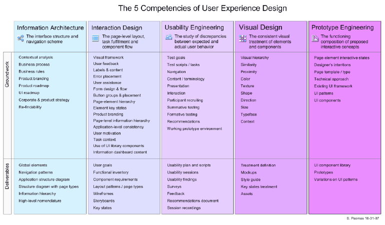
The design in web design is not just about colors, textures, shapes, photography, and fonts. In fact, these elements (Visual Design) make up just 1/5 of a website.
That’s right, just ONE-FIFTH.
A website that solves problems embraces all 5 competencies of user experience design:
- Information Architecture
- Interaction Design
- Usability Engineering
- Visual Design
- Prototype Engineering
When a website focuses exclusively on Visual Design, it neglects the other critical competencies of user experience design (img credit: UXmatters)
If design isn’t thought of holistically, there’s dangerous cross-over into the Art-centric mindset and the whole “Do you like it?” will rear its ugly head.This is why web design becomes misunderstood. Maybe because of simple ignorance, or possibly — and, sadly — stubbornness (a big reason Brochure Websites continue to exist).
What are the consequences of treating a website like Art?
When a website reduces its design phase to meet an ambiguous goal of “what feels good” (thus treating it like Art), it becomes void of:
- goals
- research
- solid structure
- the application of psychology (such as persuasion triggers)
- correct technology decisions
- usability
- valuable content
- calls to action
- measurement & ROI analysis
This myopic approach (prioritizing just the visual design) deflates a website to a rudimentary level and consequently never satisfies any real business objectives.

In Review
As I mentioned earlier, design is polarizing. This topic (“web design vs. Art”) only adds to the polarization, but also introduces some ambiguity.
Let me combat that by summarizing my position:
- A website solves problems. Art doesn’t have to solve a problem to be considered successful.
- A website experience and an Art experience are vastly different because of the interaction element.
- You can measure whether a website’s design is successful. With Art, you can’t because of its subjectivity.
- The process a designer takes to create a useful website is significantly different than the process an artist takes to create a beautiful piece of art.
Don’t design for fleeting warm fuzzies, design to solve problems
Warm fuzzies come and go with ease. Business problems do not. They need fixing.
When a website’s design becomes more holistic, accounting for all 5 competencies, it alleviates chronic issues in a company’s communications, marketing, and sales.
That’s a website designed for people. Not a feel good moment.
Need website help?

We're all about websites — especially websites that are loved by people and Google.
Since 2001, we've been helping clients nationwide turnaround their outdated and under-performing websites.

"Our website is generating quality leads every week thanks to their website consulting."
Steve L.
Cactus Technologies
Hey, you made it!
There is gobs of information available today — I'm honored you found this article interesting enough to make it here. I hope this insight leads you to a better-performing website!

About the Author
Eric Sharp is the founder of ProtoFuse and has been in the website trenches since 1999 — right before the dot-com boom redefined the website landscape. Since then, he's accumulated 25 years of digital marketing experience and prides himself on creating websites "Loved by people and Google". Outside of websites, it's all about fam time with his wife and 3 kids. He enjoys CrossFit, cooking steak on his cast iron skillet, collecting Jordan sports cards, and Daaa Bears.

