How to Nail Your Website’s Visual Design, Look & Feel
Updated last on:
July 14, 2022
To nail a website’s visual design (aka look & feel), it demands research, creative activities, and organized collaboration. Follow these 6 recommendations for a smooth creative process and a website that'll align with your brand's personality.

by Eric Sharp
TOPICS:
Quick Summary
Visual design is the use of color, imagery, shapes, and typography within a website. It's also referenced as the "look and feel". A website's visual design is much like the curb appeal of a home because it creates a visceral reaction — either positive or negative. This reaction is immediate and powerful. When a website's poor visual creates a negative impression, it leads people to assume a website is untrustworthy. To ensure a website nails its visual design, it takes plenty of planning, creative exercises, and communication. Approach this with; lengthy branding guideline discussions, documenting inspiration (competitors, non-competitors, industry related, non-industry related), a design gut check exercise, and web design mood boards. By focusing on a "professional" design rather than a "pretty" design, you'll ultimately establish a look and feel that fits your brand and enjoy the creative process along the way.
Visual Design is no easy thing to achieve
I Like It!
Three simple words.
They’ll make a website designer smile ear to ear, and a website owner exhale with joy — or relief, depending on how the creative process went.
It’s not easy to get a website’s visual design (aka look & feel) done right.
After presenting 100+ designs over the last decade, I know of the long hours needed and the nervous energy — on both sides — the whole process could bring. Though not perfect, my team’s approach for finding a website’s visual design is working well these days.
Over the years, we iterated on what works and experimented with new tactics to slowly evolve our creative approach.
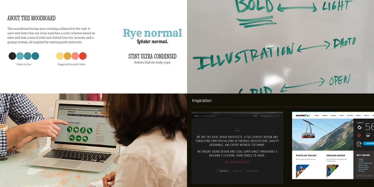
We hear “I like it!” exactly when we need to within the process because we emphasize research, documentation, hands-on activities, and collaboration. Not some grandiose presentation you’d see in Mad Men.
So, how exactly do we approach the visual design phase? Our secret sauce has 6 ingredients. But first, let’s ensure we understand visual design and its role in your website.
What is Visual Design?
Look and feel, to put it simply. Let’s see how others define it.
The use of imagery, color, shapes, typography, and form to enhance usability and improve the user experience.
Visual design focuses on the aesthetics of a site and its related materials by strategically implementing images, colors, fonts, and other elements.
The consistent visual treatment of elements and components.
I like that UXmatters used consistent in their definition.
A Helpful Analogy
A home’s curb appeal is visceral — like a website’s visual design.

A website’s visual design is a lot like the curb appeal of a home.
Fresh paint, new roof shingles, manicured landscaping, carefully laid pavers, an inviting and boldly painted front door — these elements quickly say “Welcome!” or “Meh”.
This reaction is visceral. And your website’s visual design also creates a visceral reaction.
Visual design is, visceral
In his book Emotional Design, Don Norman describes 3 aspects of design:
- Visceral (appearances)
- Behavioral (please & effectiveness of use)
- Reflective (rationalization & intellectualization)
The visual design process of a website will lock in, explore, and appeal to the first aspect; visceral.
This phase gets tricky because people have a gut reaction (positive or negative) to imagery, color, shapes and typography. This is why a website’s appearance can become a moving target — everyone (even your Grandmother) has preferences and pre-disposed ideas!

Luke Wroblewski said it best:
Reactions to the visceral level of design are immediate and powerful. It only takes a second to determine if the “look and feel” appeals to you.Luke Wroblewski
Visceral opinions are what trips up creative collaboration. When this energy isn’t channeled and utilized properly, the collaborative spirit (and website progress) goes awry.
Why visual design is important to get right
OK, so the visual design of a website is challenging. I’m sure you’ve picked that up by now. But, why is this important?
Well, first impressions matter and a poor visual design creates a negative impression (which leads people to assume a website is untrustworthy).
There’s not many things more important to your website than being trustworthy, and a professional visual design is a great start to building trust with a visitor.
The magic formula: 6 elements to a successful visual design
Now that we have an understanding of what visual design is, the role it takes in a website, the challenges its visceral nature brings, and why it’s important — here’s our formula for nailing it.
Below are the 6 elements of research, activities and collaboration we rely on to perfect a website’s visual design.
1.) Discuss Branding Guide
This is our very first conversation. There are two reasons we discuss a company’s branding right out of the gates:
- It’s an easy conversation. Which, jumpstarts the creative process.
- These elements are fundamental.
A company’s style guide (logo usage, color palette, typography, photography style) is a step in the right direction. Starting off a visual design phase by — let’s say improperly using the logo — won’t build confidence and kills momentum.
This ensures the website reflects the company’s personality — a key attribute to a brand consistency from one medium to the next.
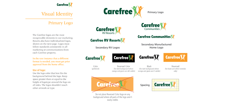
2.) Discuss Branding Guide, again (and what can change on the website)
Once we see which branding elements are off-limits, we then discuss which elements are NOT off-limits.
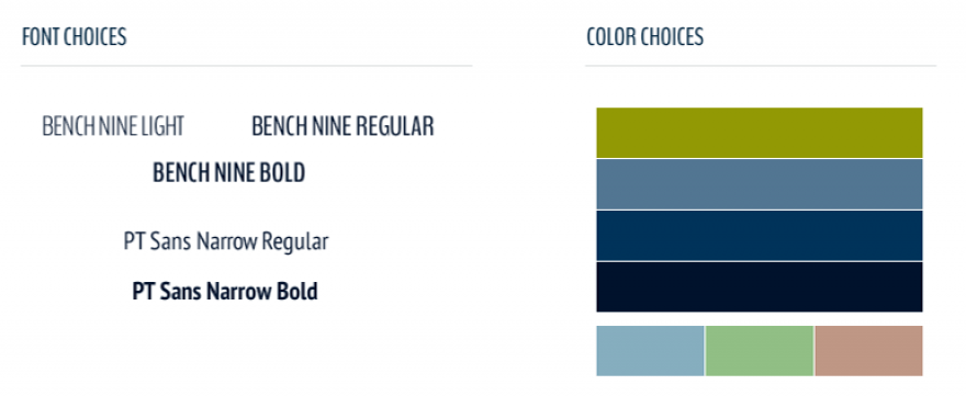
From our experience, many small to mid-sized businesses are relatively flexible with their typography and color palette, so it’s a natural conversation. If their branding guide contains fonts that aren’t web-friendly, we try to find a similar replacements. If the color palette is too simple (1-2 colors), we recommend broadening the website palette with some complimentary colors.
A more sophisticated color palette and a web-friendly font pairing increases our chances to delivering a richer visual design.
3.) Analyze & document inspiring Industry, Competitor Websites
Let me put a disclaimer on this activity: it’s not smart to copy your competitors. ConversionXL explains why copying competitors is dangerous:
The problem is that copying a design style, information about architecture, web copy, service claims, or sign up flow is not copying a formula for success. Even if you copy something that’s working for them, it doesn’t mean it will work for you.ConversionXL
Once we preface this activity, and the client shakes their head in agreement, we’re off in collecting and reviewing the visual design approach of competitor websites. We keep the list short (3 to 5) to ensure the entire process stays purposeful, rather than a glorified stalk-fest.
4.) Analyze & document inspiring non-industry, non-competitor websites
We believe inspiration can come from anywhere — even outside of a company’s industry or niche.
This list is also short (3 to 5) and we discuss how these website’s visual design could be experimented with moodboarding (#6 below).
Typically, the client comes to the brainstorm with something like “I was checking out Website.com earlier, and x element was interesting” and we facilitate a candid conversation on whether or not that direction is fitting for their brand’s personality.
5.) Design Gut Check
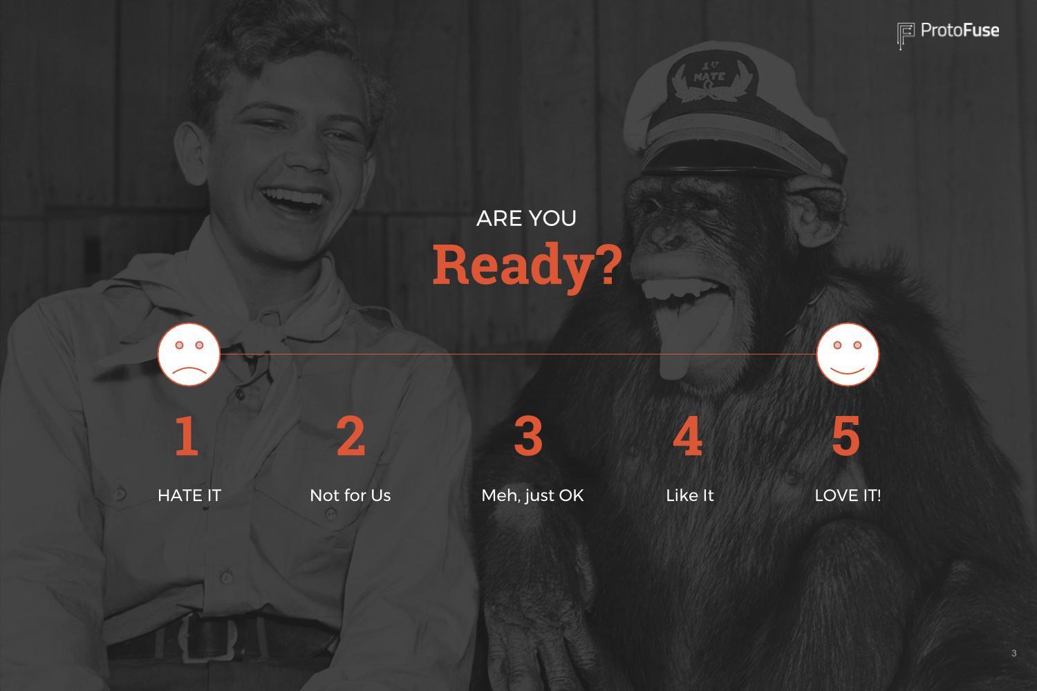
This exercise takes some work to facilitate, but it has laser-like precision in identifying that visceral-ness of a client.
I first heard of the Design Gut Check from Big Sea Design, who discovered it on Good Kickoff Meetings: 20 Second “Gut” Test, but it looks to originate from designer Chris Cashdollar.
The Design Gut Check goes something like this:
- Gather ~20 websites (each different in style)
- Hand out score sheet to clients
- Show 1 of those websites for 20 seconds
- Have client score it from 1 to 5 (1 = “Hate It”, 5 = “LOVE IT!”)
- Repeat for other websites
- Gather scores, see which websites score the highest
Don’t reveal the 20 websites before the activity begins. A client should be having their initial gut reaction to every single website. If they’ve seen or used the site before, the essence of the exercise is lost. A design gut check takes around 10 minutes once it begins. But, most of the work happens beforehand to set up the exercise.
6.) Mood Boards
Once a few of the previous activities are completed (or ALL if the budget allows), it’s time to actually design something. Cue the website mood board.
Mood boards are the canvas to which visual design experimentation comes to life. We typically create 2 or 3 different mood boards for websites depending on the engagement. I wouldn’t recommend more than 3, as more options tend to create analysis paralysis.
I can’t imagine trying to lock down a website’s visual design without utilizing mood boards. They’re incredibly powerful if the client understands their purpose (and doesn’t mistake them for mockups — which is typically the next step in the overall website process.)
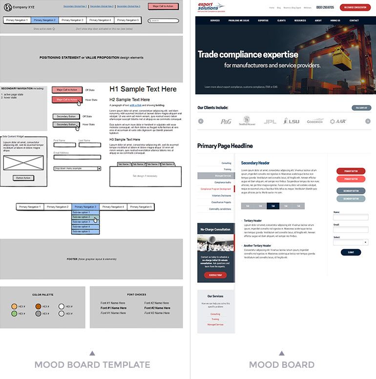
I can’t imagine trying to lock down a website’s visual design without utilizing mood boards. They’re incredibly powerful if the client understands their purpose and doesn’t mistake them for mockups — which is typically the next step in the overall website process.
More pro tips for nailing your website’s look & feel
Here are 2 more pro tips to keep in mind as you prepare and go through the visual design of your website.
Pro Tip #1: Focus on a professional design, rather than pretty design
Color harmony, proper font pairing, use of whitespace — this chatter isn’t necessarily in the average person’s vocabulary, but this professional dialogue needs to drive a visual design phase. “Pretty” is ambiguous and hard to measure.
Avoid “our website needs a pretty design” and instead say:
Our website needs a professional design.
Pro Tip #2: Don’t approach a visual design phase like it’s a Don Draper presentation
Sometimes businesses think nailing their website’s visual design is about finding that perfect designer that “Will see my vision.” Though there are plenty of talented website designers today, a website’s look and feel is less about design wizardry and more about collaboration.
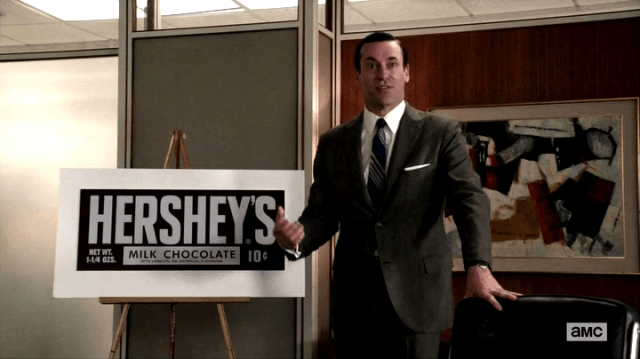
Enjoy the process!
Productive visual design collaboration is difficult to achieve without research, activities and clear communication.
Good luck. Keep it fun for everyone involved. And enjoy the entire creative process!
Need website help?
We're all about websites — especially websites that are loved by people and Google.
Since 2001, we've been helping clients nationwide turnaround their outdated and under-performing websites.

"Our website is generating quality leads every week thanks to their website consulting."
Steve L.
Cactus Technologies
Hey, you made it!
There is gobs of information available today — I'm honored you found this article interesting enough to make it here. I hope this insight leads you to a better-performing website!

About the Author
Eric Sharp is the founder of ProtoFuse and has been in the website trenches since 1999 — right before the dot-com boom redefined the website landscape. Since then, he's accumulated 25 years of digital marketing experience and prides himself on creating websites "Loved by people and Google". Outside of websites, it's all about fam time with his wife and 3 kids. He enjoys CrossFit, cooking steak on his cast iron skillet, collecting Jordan sports cards, and Daaa Bears.

