Is Your Website Generic? 5 Lazy Design Decisions that Do Damage
Updated last on:
February 7, 2023
Are you cutting corners with your website’s design? Don’t. Lazy design decisions output a dull, under-performing & generic website. Avoid these 5 lackadaisical design decisions.
by Eric Sharp


Is Your Website Generic? 5 Lazy Design Decisions that Do Damage
Updated last on:
February 7, 2023
Are you cutting corners with your website’s design? Don’t. Lazy design decisions output a dull, under-performing & generic website. Avoid these 5 lackadaisical design decisions.

by Eric Sharp
TOPICS:
Quick Summary
A generic website is not created accidentally. Uninformed design decisions, paired with avoiding brainstorming and not making the necessary time, will output a dull, underperforming, and generic website. Generic websites are also void of decisions backed by data and usability studies. The 5 most common decisions that lead to a generic website are: 1) Making the logo really big 2) Using a single font, like Arial/Verdana/Times New Roman 3) Choosing stock photography and using it everywhere 4) Overusing color, preventing a harmonious color palette 5) Resorting to an oversimplified menu architecture. Also, don't confuse generic with "simple". Simple websites are scientifically better, but more because they're simpler to use by being cognizant of its details.
There’s certainly a time and place for lazy decisions.
If I haven’t planned my meals properly, you’ll find me making lazy dinner decisions — which typically involves lunch meat, some cheese, and eating over the kitchen sink (I mean, who wants to dirty a dish?)
With websites, however, lazy is much more damaging.
What is a generic website?
A generic website is a website rooted in snap design decisions, motivated by avoiding brainstorming or not finding the necessary time. They are typically void of website research, a key step in the website planning process because of the data, insights, and inspiration discovered and available.
A generic website doesn’t become a generic website by accident. Making a decision to not invest time and money into your website upfront will output a dull, common-looking, and underperforming website. When people see it, they feel it. Your business will feel it too, unfortunately.
5 characteristics of a generic website
If you want to avoid having a generic website, here are 5 lackadaisical design decisions you should never make. Let’s start with your beloved logo.
#1. Making the Logo really BIG
The king of all design spoofs: “Make the logo bigger!”
Laboring over the size of your logo is wasted energy.
Frank West (test results no longer active) ran a test on 100+ popular websites and found the average logo to be 168×64 pixels. SEOptimer recommends 250×100. Stick with a size no wider or taller, provide some whitespace around it, and make it link to your homepage. Then…move on.
There are other elements in your header (e.g. navigation, primary call-to-action) that demand more attention. Bigger is not better in this case. And logo size is not as important as you think.
#2. Choosing Generic Fonts
This is like saying, “I’ll always eat a PB&J for lunch for the next 3 years.”
Will you starve? Of course not. Is it a lazy decision? Absolutely. (You’re not in First Grade anymore!)
Your website will function if you use just Arial, Verdana or Times New Roman. But, it will have lost its soul along the way.
Websites that are enjoyable to use perform better. If your competition’s website is more enjoyable to use than yours, guess who’s probably getting the sale or lead. They will.
Pairing fonts isn’t overly difficult (even non-designers can learn), but it does take some planning. Work with a designer to choose fonts that adhere to your branding guideline and match your company’s personality.
Your website’s soul depends on it.
#3. Too much Stock Photography
If I see another stock photo of a CSR on a website’s contact page, I may just lose it…

Don’t get me wrong, stock photography is great when your content needs a visual boost. Visual content drives engagement. Sometimes, it’s just easier (and cheaper) than coordinating a grandiose photo shoot.
However, an overuse and improper use of stock photography will make your website feel outdated, cold, unnatural, and of course, generic.
If you must use stock photography, never use these 7 types of images:
#4. Overuse of Color

It may seem like you’re designing a stunning website by getting crafty with your color choices, but all you’re really doing is avoiding a harmonious palette. Not using color correctly spawns usability issues, accessibility issues, and has an impact on conversion rate.
But, Eric, we have a very colorful palette!
That’s OK. Some brands have vibrant branding. But, more is not better in how you use the color on a website. Rely on web design mood boards to establish hierarchy and contrast.
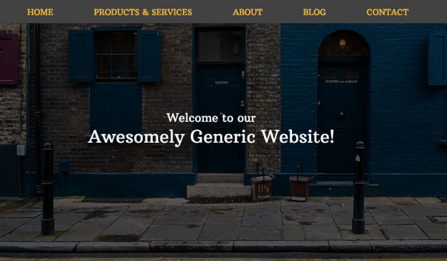
#5. Oversimplified Primary Menu
We only need five sections in our menu.
- Home? Check. (Note: there is a usability case for putting “Home” in your menu)
- Products & Services? Check.
- About? Check.
- Blog? Check.
- Contact? Check.
Congratulations! Your website just won the ‘Generic Website of the Year’ award.
Yes, “simple” websites are scientifically better, but this doesn’t mean a generic architecture works for every business. Your website has a unique story to tell, right? You want to inspire people to click more than one page, right? You want your architecture to allow for growth, right? Defining your top level menu/navigation speaks volumes to your visitors.
As we explored in how to site map a website, always be concise and use common language. But, don’t oversimplify this for the sake of being simple.
Final Thoughts
Charles Eames, a famous American designer, believed in details.
The details are not the details. They make the design.Charles Eames
And so should you.
Cutting design corners to launch your website within budget, by a certain deadline, may seem more important in the short-term, but that decision will come with chronic and long-term headaches.
At some point, you’ll need to correct your lazy design decisions. So, why not get the details right on the first go-round? Don’t own a website that looks plucked straight from a catalog. Roll up your sleeves and put in the work.
Need website help?

We're all about websites — especially websites that are loved by people and Google.
Since 2001, we've been helping clients nationwide turnaround their outdated and under-performing websites.

"Our website is generating quality leads every week thanks to their website consulting."
Steve L.
Cactus Technologies


Our Partners
Wordpress Website Hosting
Get 4 months FREE!

Wordpress Website Development, Maintenance, Support

Partner

Hey, you made it!
There is gobs of information available today — I'm honored you found this article interesting enough to make it here. I hope this insight leads you to a better-performing website!


About the Author
Eric Sharp is the founder of ProtoFuse and has been in the website trenches since 1999 — right before the dot-com boom redefined the website landscape. Since then, he's accumulated 25 years of digital marketing experience and prides himself on creating websites "Loved by people and Google". Outside of websites, it's all about fam time with his wife and 3 kids. He enjoys CrossFit, cooking steak on his cast iron skillet, collecting Jordan sports cards, and Daaa Bears.