
How to Design the Structure of a Website with Sitemapping in 8 Steps
Updated last on:
February 21, 2025
Just like a home builder needs a floor plan, your website needs a sitemap. Here are 8 steps to architecting a sitemap that'll define the structure of your website so both people, and search engines, understand it well and can use it easily.

by Eric Sharp
TOPICS:
Quick Summary
Sitemapping is the visual process of planning your website's structure, otherwise known as Information Architecture (IA). This phase is critical because IA is the foundation to the 5 competencies of UX design. Typically, a sitemap is organized in a tree-like format and done early in the website planning process. There are an array of sitemapping tools you can utilize that allow you to design a sitemap quickly, save easily, iterate, and share with your team. The 8 key steps to the overall process are: prepare for sitemapping, brainstorm types of content, define primary navigation, define second/third level hierarchy, account for utility pages, capture page notes and specs, decide on type of page template (e.g. form, gallery, PDF, etc.), and iterate until complete.
Website structure = home structure?
Pretend you’re a home builder for a moment.
Would you break ground on a new home that didn’t have approved floor plans? Are you OK with improvising for the next few months? Will your team of contractors be confident in the final result? (If you said ‘yes’, please stick with your day job!)
Similarly to how floor plans communicate a home’s structure, a sitemap communicates a website’s structure.
Designing a detailed sitemap involves eight steps, and each step will prevent a “wing it” approach during your website planning and build clarity and confidence along the way.
What is website sitemapping?
Sitemapping is the visual process of outlining a website’s structure, high-level functionality and navigation scheme. The end deliverable can be a sketch, image, PDF, or presented in a tool like SlickPlan (my full list of sitemapping tools towards bottom).
A website’s sitemap should be defined early in the website planning process. There’s only a handful of activities that should precede this step (e.g. Business Objectives, User Research).
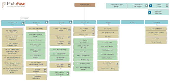
Why is website sitemapping important?
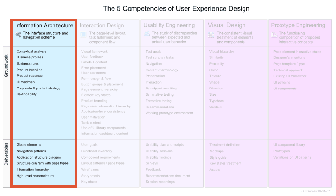
Sitemapping is a critical phase to the structure of a website because it represents a crucial deliverable of information architecture (IA) — the foundation to the five competencies of user experience design.
How critical? Well, bad information architecture causes most user failures.
8 steps to plan & create a website structure with a site map
How do you plan the structure of a website? Here are the 8 steps:
- Prepare for the activity of sitemapping
- Brainstorm types of content
- Define primary navigation
- Define secondary & tertiary level hierarchy
- Utility pages
- Page notes and high-level specifications
- Designate the type of page template
- Iterate, iterate, iterate
Now, let’s deconstruct each step.
1. Prepare for the activity of sitemapping
Before jumping into your site map design, you’ll need to prime the pump by addressing three areas:
- Time – A strong sitemap isn’t designed in 20 minutes. Does your organization have the necessary collaboration time?
- People – Key stakeholders should contribute to the sitemap design. Who are these people? Are they the right people?
- Research – What are the website’s objectives? Who are our users? What kind of information do they need? What does our analytics tell us?
HELPFUL HINT
Don’t assume that Marketing and Sales know it all — involve various departments. The diversity of company, industry, service and product knowledge will be beneficial.
2. Brainstorm the types of content
Before you start defining navigational elements (Step #3), you’ll need to discuss your website’s content. What services/products are we marketing? How much company info will be presented? Do we have testimonials? What helpful resources can we provide?
Don’t focus on where that content goes in the sitemap just yet (Step #4). Give yourself the freedom to think openly — even wildly! Bad content ideas will naturally work their way out with time.
HELPFUL HINT
Follow the 80/20 rule of content (80% valuable content / 20% promotion)
3. Define primary navigation
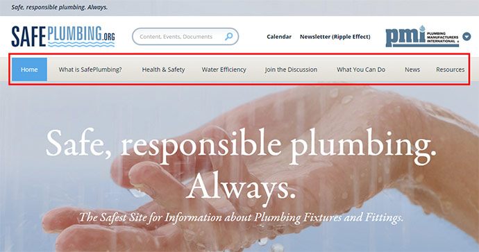
Also referred to as “1st Tier”, “Main”, “Top Level”, or “Global”, primary navigation is typically found at the top of a website in a horizontal design. Though there’s a case against vertical navigation, some websites still take this approach (e.g. Amazon).
Your sitemap’s primary navigation should…
- Be concise – each element should target 1 to 5 words (‘About’, ‘Contact Us’) rather than full sentences
- Use common language – avoid naming navigation that only make sense internally. Use the KISS principle (Keep It Simple Stupid)
- Communicate top-down hierarchy – can someone easily peruse or find information?
- Allow the site to grow – your primary navigation shouldn’t need re-tooled every time you add new content or features
HELPFUL HINT
There’s no magic number to how many elements live in your primary navigation. Even though 7 items or less is a UX Myth, it’s still important to practice brevity. If your site map design outlines 10+ elements, there might be an opportunity to consolidate.
4. Define secondary & tertiary hierarchy
With primary navigation established, it’s time to drill deeper into each section.
For most websites under 50 pages, a second level of structure should be sufficient. For larger websites, third level is typically needed to maintain a solid hierarchy. I’ve even seen some websites go four levels deep (this is pretty typical of academic websites where there’s gobs of content).
Unlike your primary nav where the number of elements should be concise, secondary/tertiary levels of content is somewhat unlimited — within reason of course. The challenge with multiple levels is designing menu systems that allow for easy scanability and findability.
HELPFUL HINT
As you flesh out page after page, your overarching primary nav will be put to the test. Don’t be afraid to tweak as your website structure comes into view.
5. Don’t forget about utility pages
Privacy policies, disclaimers, legal information — all critical pages that need a home in your website. Don’t lose track of these in your sitemap. Carve out a spot for them in your footer or elsewhere. This content could take weeks or even months to finalize!
We want our website’s privacy policy to hold up launch.Said no one ever
HELPFUL HINT
Contact your legal department sooner rather than later.
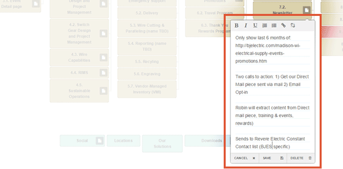
6: Create notes and high-level specifications for each page
We’ll just have some basic content for this page.
No. NO. NO!
Take a moment to think, specifically, about each page’s content. What existing assets are available? What new assets need created? How deep do our archives go? What will be our blog topics?
Put content first because it’s the heart of every website.
HELPFUL HINT
If you need a good starting point, lead with word count. Short and sweet (under 100 words) or rich and hearty (500+ words)?
7. Designate type of page template (e.g. form, gallery, PDF, etc.)
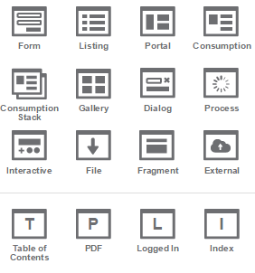
Is this page a photo gallery? Conversion form? Table of contents? PDF?
This activity can become the curious case of chicken or the egg. How can you identify what design template your content needs when the content isn’t finished?
The key here is that you’re not actually designing the user interface (UI), you’re identifying the type of content. This identification helps guide the content curation process and warms the engine for wireframing your content (aka UI design) down the road.
HELPFUL HINT
Designate every page’s template. If you don’t know it yet, label it “TBD” and iron out as you iterate.
8. Iterate, iterate, iterate

Version 1 of your sitemap will almost never be the final and best version. Create a new version as your sitemap undergoes heavy change. You can always revert to a previous version.
I like to create new versions for different days of brainstorming. New day = new version.
HELPFUL HINT
Shoot for ~85% accuracy with your website’s structure before creating a clickable prototype of your website.
Sitemapping Tools
I’m a big advocate of website tools that don’t require software and are operating system agnostic. Speed, version control, and shareability trump everything when it comes to designing a site map.
That’s why we stopped using Mindjet’s MindManager, would never recommend a bloated software like Illustrator, and fell in love with SlickPlan (try Slickplan’s 30 day free trial).
Here are a few other sitemap tools that will help you plan the structure of a website:
Final thought: Remember, activity over tool
The sitemapping tool itself is not more important than the actual activity of sitemapping. Tools facilitate collaboration, capture ideas and help you iterate on them.
However, the actual discussions, idea generation and decisions are the keys to a successful sitemapping phase. Focus on principles first and foremost and find a tool that embodies those principles.
What steps and sitemapping tools do you use to design a website’s structure?
Need website help?

We're all about websites — especially websites that are loved by people and Google.
Since 2001, we've been helping clients nationwide turnaround their outdated and under-performing websites.

"Our website is generating quality leads every week thanks to their website consulting."
Steve L.
Cactus Technologies
Hey, you made it!
There is gobs of information available today — I'm honored you found this article interesting enough to make it here. I hope this insight leads you to a better-performing website!


About the Author
Eric Sharp is the founder of ProtoFuse and has been in the website trenches since 1999 — right before the dot-com boom redefined the website landscape. Since then, he's accumulated 25 years of digital marketing experience and prides himself on creating websites "Loved by people and Google". Outside of websites, it's all about fam time with his wife and 3 kids. He enjoys CrossFit, cooking steak on his cast iron skillet, collecting Jordan sports cards, and Daaa Bears.


