Website Makeover: How to Evaluate if You Need One
Updated last on:
April 4, 2022
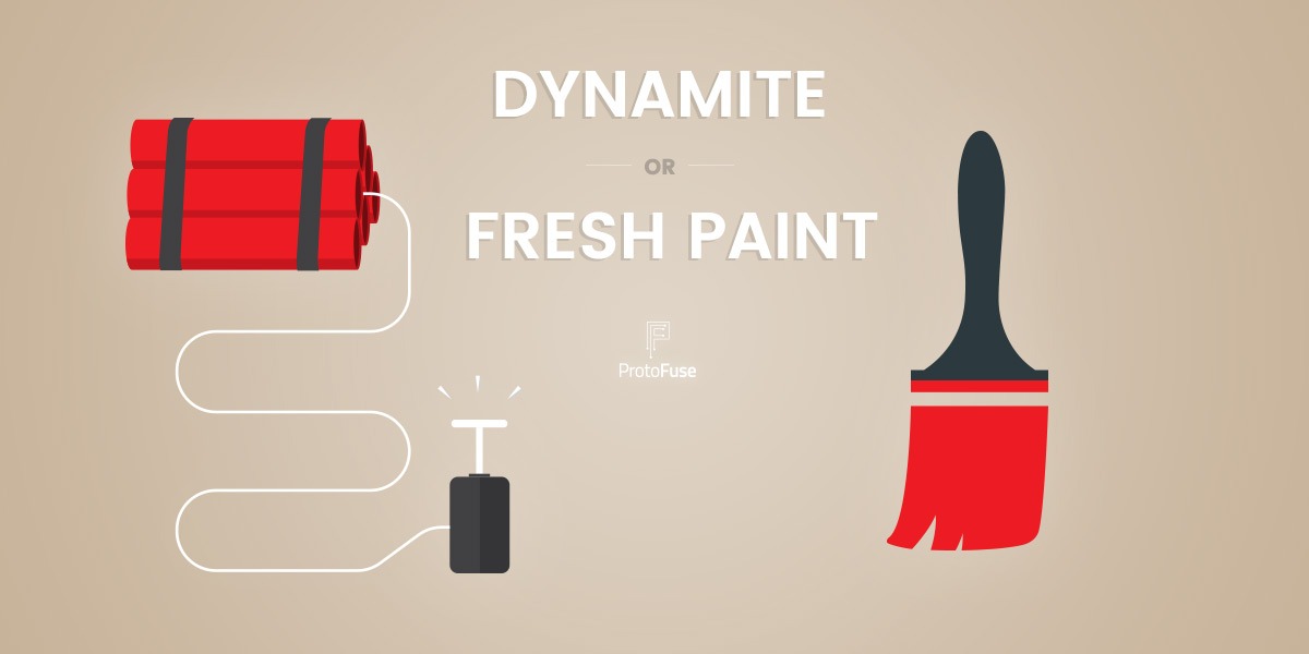
Think you need a website makeover? You have 2 options. You can blow it up and start anew (bring on the dynamite) or make small improvements slowly (grab the fresh paint). If you're unsure, these 20 points will help you decide.

by Eric Sharp
TOPICS:
And Here We Go.
Remember that classic scene at the end of The Dark Knight?
The Joker believes he’s masterfully engineered an explosion, but to his dismay, nothing gets destroyed. Nothing gets blown up. It’s business as usual.
Have you ever wanted to blow up your website?
Did you plan on a complete website makeover, but never actually detonated? Maybe you opted to improve a few things here and there instead. Or, perhaps, things felt so helpless you didn’t do anything. Make a decision to not make a decision, as productivity experts preach. I’ve seen this dilemma numerous times in the last 15 years of helping clients. Tear down, redesign and launch something completely new? Or, simply make small positive changes?
You have 2 options when it comes to a website makeover
- Bring on the Dynamite! (blow it up and start anew)
- Apply Fresh Paint (make small, incremental improvements)
A website makeover presents 2 convincing options
Don’t let any indecisiveness create guilt here. This dilemma comes with a lot of gray.
Kissmetrics makes a strong case that an “Evolution beats Revolution” — mainly because “most redesigns are often based purely on aesthetics.” I agree with that. Making minor tweaks and adjustments to evolve a website could be wiser than redesigning. It allows you to capture the low hanging fruit, fix minor bugs, and not invest heavily upfront.
However, things get mucky when evolution gets confused for band-aids. Blowing up your website and starting fresh is sometimes the only way to fix the crux of your website problems. But, this choice is a big deal. It takes time, the right people, big decisions, and oh yea — money.
Below I’ve listed out 20 signs (10 for each option) that’ll settle your website makeover dilemma.
Dynamite or fresh paint?
Let’s find out!
Website makeover option #1: Blow it up, baby!

Here are 10 signs your website makeover involves blowing things up and starting anew.
- Dynamic URLs. Want to kill your SEO efforts? Stick with dynamic URLs. When websites can’t generate SEO-friendly URLs (a common SEO mistake), it’s a telling sign that the CMS (which is your website’s engine) isn’t a long-term fit. This harsh reality requires a rebuild most of the time.
- Hash sign (#) URLs. Let’s stick with URLs. A hash sign (#) in a URL is referred to as a fragment and looks like this (example.com/services.html#info). They automatically set the browser’s scroll position to a predefined location in the web page. No problem, right? Wrong. Hash sign based URLs may seem harmless, but they’ll limit the effectiveness and clarity of your SEO, social, and overall website usability. Sure, there are workarounds, but is it worth the hassle? I don’t think so. This structure is hard to tackle without blowing things up.
- Colors, images & fonts don’t reflect current branding. It’s challenging to make incremental changes to a website when a company’s branding has changed. New voice. New style. New communication style. Taking a “we’ll swap this color for that” approach creates UI and Usability issues.
- No keyword strategy. If your website is seeking organic traffic (what site isn’t?) and there’s no documented plan for which keywords you’re targeting (read: Keyword Research Tips), start thinking reboot. Can a website’s SEO be improved without a revamp? Of course. But, a solid keyword strategy requires structural and content synergy and sometimes that’s difficult to accomplish iteratively.
- Usability issues galore. Broken images, broken links, buggy drop down menus, major features don’t work in Internet Explorer 10 — does your website seem like a black hole? The good continues to disappear, and less and less works over time. These chronic issues stem from an outdated website and starting fresh with a complete makeover is the best move.
- Content hasn’t been updated in years. Content is at the heart of every website. When it becomes so old that you’re embarrassed by it — big sweeping changes are on the horizon. Sure, you could make small edits to existing content, but revamped content typically warrants a new website structure.
- Your Company’s Services & Products have drastically changed. When what you’re selling changes, everything on your website needs a makeover. Your calls to action, content strategy, copy, visual design — the list goes on. Pull out the dynamite.
- Not mobile-friendly. This one is borderline because making your website mobile-friendly, sometimes, doesn’t demand a blow-up — an RWD (Responsive Web Design) conversion may be the simple solution. However, depending on the state of your site, an RWD conversion isn’t always easy and instead, may provide the opportunity to start fresh.
- You have no sense of who exactly your website is for. Every single design, content, and marketing decision you’re currently making could be wrong. Ouch, right? If you haven’t developed website-specific user personas, drop everything and begin there. What is discovered in those personas will probably warrant a complete makeover.
- Your site is in Flash. Enough said. Grab as much dynamite as possible. 🙂
Feeling inspired to blow things up? “Hold your horses” as my Dad used to say. Let’s see if some fresh paint is the better option for your website makeover.
Website makeover option #2: Fresh paint

Doing small and calculated changes isn’t near as fun as redesigning from scratch. But, for some websites, it’s the best business decision. Make no mistake here. When I say fresh paint, I don’t mean slapping on a new look and feel.
Fresh paint, in this context, means:
Minor and incremental improvements without a teardown.
Here are 10 signs your website makeover involves making small and incremental improvements.
- Hidden or Unknown Calls to Action. What kind of action(s) do you want users to take? Does your website make that crystal clear? If not, follow our website call to action best practices and begin dropping them onto every page.
- You have great content, but it’s not formatted well. It’s hard work to write quality content. If your website content isn’t formatted properly — people won’t read it. Taking your existing content and making it “scannable” will improve user engagement across the board (and feel like a major upgrade!)
- Your conversion rate has flat-lined or dropping. This could be related to the smallest of details (e.g. using negative words like “Submit” or “Click Here”) or the biggest of issues (e.g. a step to your checkout process is broken). Conversion optimization doesn’t require a teardown. The sum of small tweaks can have a huge difference.
- People aren’t filling out your forms (e.g. “Contact Us”, “Free Consultation”). Since these forms typically reside on a single page, simply address a single page of your website. Limit required fields, add click triggers, provide incentives. There’s nothing wrong with taking a page by page approach to your makeover.
- Your logo has changed. This could be a simple swap with your old logo (adjusting some .css code). But, if your overall branding has changed considerably, see #3 in my “blow it up” list above.
- You want to integrate with a CRM or Marketing Automation platform. Integration. It’s the future of the Web. The beautiful thing about integrating with these powerful systems is that’s it’s fairly straight forward. No need to hit the reset button here.
- You’re not tracking conversions in Analytics. Easy fix here. Just set up Google Analytics, insert the tracking code, and set up goals (tutorial here).
- You have a Brochure Website. You can diverge from this by quickly creating valuable content in a blog. Blogging not for you? These 3 simple reasons to start a blog may convince you otherwise.
- Your organic rankings have plateaued. It can feel liberating to overhaul when your SEO is not improving. But, maybe there’s technical SEO issues. Maybe you’re targeting the wrong keyword. Maybe, you just haven’t given it enough time (remember, SEO is slow.)
- Your homepage feels like a smorgasbord. Welcome to the party because almost everyone gets their homepage wrong. Redesign your website’s homepage with these 8 ingredients and you’ll see positive quantitative results.
Which website makeover option is best?
Dynamite or fresh paint? Still not inspired to choose one or the other? Here’s what I’d do.
Start with fresh paint. Dive in. Make progress. Create momentum. Enjoy the small wins.
If you run into a major stumbling block (maybe something I’ve listed in the “Bring on the Dynamite” list), then that’s a good thing. You’ll then feel the conviction you seek to invest in blowing things and starting anew. Don’t be The Joker. Have a plan. And ensure it works.
And Here You Go.
Need website help?

We're all about websites — especially websites that are loved by people and Google.
Since 2001, we've been helping clients nationwide turnaround their outdated and under-performing websites.

"Our website is generating quality leads every week thanks to their website consulting."
Steve L.
Cactus Technologies
Hey, you made it!
There is gobs of information available today — I'm honored you found this article interesting enough to make it here. I hope this insight leads you to a better-performing website!


About the Author
Eric Sharp is the founder of ProtoFuse and has been in the website trenches since 1999 — right before the dot-com boom redefined the website landscape. Since then, he's accumulated 25 years of digital marketing experience and prides himself on creating websites "Loved by people and Google". Outside of websites, it's all about fam time with his wife and 3 kids. He enjoys CrossFit, cooking steak on his cast iron skillet, collecting Jordan sports cards, and Daaa Bears.


