Website Homepage Design: Best Practices, Mistakes, Examples
Updated last on:
March 2, 2023
Your homepage should be deliberate about its architecture, copy, conversion strategy, and SEO choices. Regardless of company type, industry or offering. Here are 8 critical ingredients.

by Eric Sharp
TOPICS:
Your homepage is, kind of, important
Your homepage might generate more views and links than any other page of your website. It could also be the starting point for many of your visitors. It’s a very unique page deserving of careful planning, research and design.
So, how exactly do you design a homepage?
Are there critical ingredients, regardless of business type, industry, service and product offering? I believe there are. In fact, studies back up the theory that a website’s homepage design should be deliberate about its architecture, copy, conversion strategy and SEO choices.
Here’s my case for 8 critical ingredients for your homepage page design.
1 – Clear Navigation
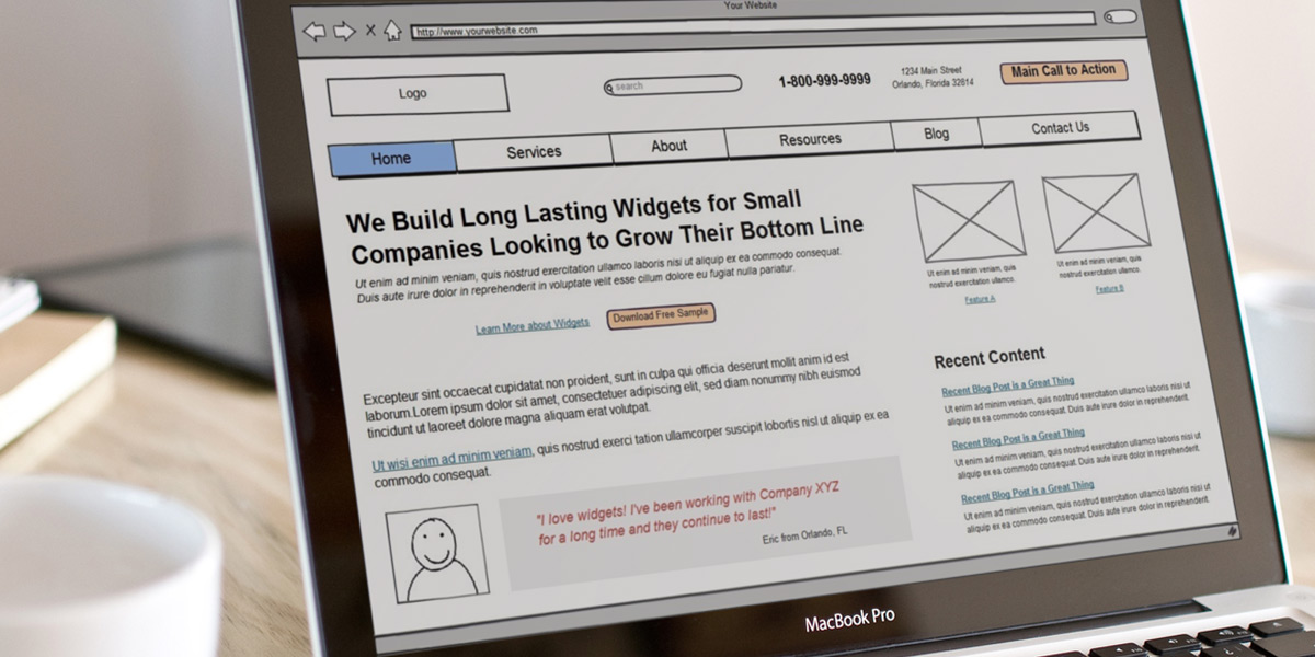
Aiming to frustrate your visitors within a few seconds? Design your website without a clear or easy to use navigation and you’ll nail it. Unintuitive menus and odd jargon will create more problems than they’ll solve.
Your homepage along with all pages, should avoid clever labels or internal nomenclature (which forces people to translate your creative vocabulary).

Navigation is the gateway to experiencing your website’s full experience. Always side with simple menu naming and layouts.
2 – Value Proposition, Positioning Statement
A clear value proposition and positioning statement (a subset of a value proposition) are common missing ingredients on homepages. That’s a shame because a value proposition is maybe the single most important element of your home page design.
- Value Proposition: explains how your product/service solves problems through benefits & differentiation
- Positioning Statement: what you do, who you do it for
This copy should be written concisely — ideally in a headline, sub-headline, bullet format. To hit a home run, make this message visually appealing to fit your brand’s personality by using web design mood boards to nail how it’s presented. More on how you can integrate your value proposition on your website.

3 – Content & Links for Search Engine Indexing, Ranking
Many people believe that a large, auto-rotating image carousel with generic stock photography is sufficient for your homepage. This design decision unfortunately comes laced with negative repercussions. They shortchange your SEO opportunities, spawn accessibility issues, and usability studies show they annoy users.
A homepage provides a canvas to display indexable content and internal links — inspiring users to explore your site deeper. However, avoid copy that is self-oriented and filled with jargon. Valuable content and carefully placed links in the body of your homepage will help search engines understand, index, rank and grant authority.
4 – Recent Content
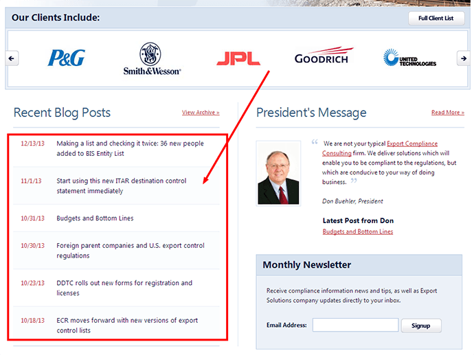
Have a blog, newsletter, webinar or event information that generates new content on your site periodically? Are you automatically pulling in a link and teaser to this fresh content on your homepage?
Showing examples of real site content (e.g. link to a new blog post accompanied by a short abstract) rather than simply saying Click Here to Read Our Blog will always win out because specifics beat abstractions.
Don’t be afraid to show some of that recent content on your homepage design!

5 – Most Wanted Call to Action
Your most wanted call to action should be placed above the fold on your homepage. Don’t create more ambiguity with a hidden CTA. Inspiring and building trust on your homepage is challenging enough! Be upfront about what specific action you’re trying to encourage.
Ensure your CTA follows best practices and remember that action is the true measure of success for today’s website.
6 – Search
When a visitor arrives on your homepage, they’ll either be in one of two modes when it comes to information consumption.
- Active: Looking to find, do, or read something very specific
- Passive: Browsing casually (maybe for the first time) and taking in what you have to offer
Displaying a clear search field — above the fold and preferably in the header — is beneficial to both active and passive visitors, but certainly to active ones. As with most items on this list, be sure a search feature is available site-wide and not just on your homepage.
7 – Social Proof for Credibility
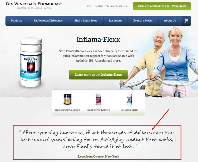
Establishing credibility on your homepage is certainly a critical ingredient in developing trust. In fact, that’s the psychological phenomenon behind social proof (when a person is unsure of the correct way to behave, they look to others for cues on correct behavior).
Social proof says, “Hey, others have used this service/product and vouch for it!” 70% of Americans say they look at product reviews before making a purchase.
Reviews, ratings, customer testimonials, or incorporating social media plug-ins (e.g. Facebook’s “Recommended/Like”) are all influential pieces to the social proof puzzle.

8 – Contact Information
The most straightforward ingredient to your website’s homepage design is your contact information. A few lines of text can have a huge impact.
Generally speaking, ensure the basics (Company Name, Phone, Email) are easily viewable within the footer so you’re not forcing a user to drill down into a back page to retrieve. This doesn’t mean remove your “Contact Us” section. Keep that section accessible in your navigation as most people look for those trigger words.
If your business relies on incoming calls, it may make sense to place your phone number above the fold in your header.

Further Resources around How to Design a Homepage
- How to Design a Home Page that Converts (conversion optimization specific)
- What Should I Put on the Homepage? – Whiteboard Friday (SEO specific)
Need website help?

We're all about websites — especially websites that are loved by people and Google.
Since 2001, we've been helping clients nationwide turnaround their outdated and under-performing websites.

"Our website is generating quality leads every week thanks to their website consulting."
Steve L.
Cactus Technologies
Hey, you made it!
There is gobs of information available today — I'm honored you found this article interesting enough to make it here. I hope this insight leads you to a better-performing website!


About the Author
Eric Sharp is the founder of ProtoFuse and has been in the website trenches since 1999 — right before the dot-com boom redefined the website landscape. Since then, he's accumulated 25 years of digital marketing experience and prides himself on creating websites "Loved by people and Google". Outside of websites, it's all about fam time with his wife and 2 kids. He enjoys CrossFit, cooking steak on his cast iron skillet, collecting Jordan sports cards, and Daaa Bears.


