Why a Brochure Website Doesn’t Work Anymore
Updated last on:
June 24, 2022
Do you own a brochure website? Are you wanting a brochure website? Don't settle. Listen, simple websites are good, but if you're looking to just throw up some basic info on a website, be aware that brochure websites are ineffective and useless. Here are 5 major issues to be aware of.

by Eric Sharp
TOPICS:
Quick Summary
A brochure website is a reflection of the early Internet. They’re extremely light on features, lack engagement, and put an unhealthy emphasis on aesthetics to drive their success. There are 5 major issues organizations face when they settle for a brochure website. Brochure websites are hard to measure ROI, they don't impress Google, they have a single measure of success, they're not helpful to their audience, and they don't scale well.
The moment it clicked
I’ll never forget the moment I realized ProtoFuse was officially out of the “brochure website” business.
A few years ago I was sitting in a sales meeting with two executives from a local investment firm. Though pleasant to talk to, their intent was direct and clear from the get-go.
Me: “Tell me about your needs, guys!”
Them: “Our website has got to be super slick with a kick butt design!”
Me: “Of course. A professional visual design is critical. So, what else?”
Them: “That’s it. We just want an eye-popping design that impresses.”
Me: “Any other goals? More traffic? Convince users to take action? Plan for writing valuable content regularly? Measure your investment?”
Them: “Nope, we don’t need that stuff.”
In just five minutes, both parties knew it. They wanted something we stopped offering — a brochure website. We ended the meeting earlier than planned, had a friendly goodbye, and I haven’t taken another sales meeting like it again.
What is a brochure website?
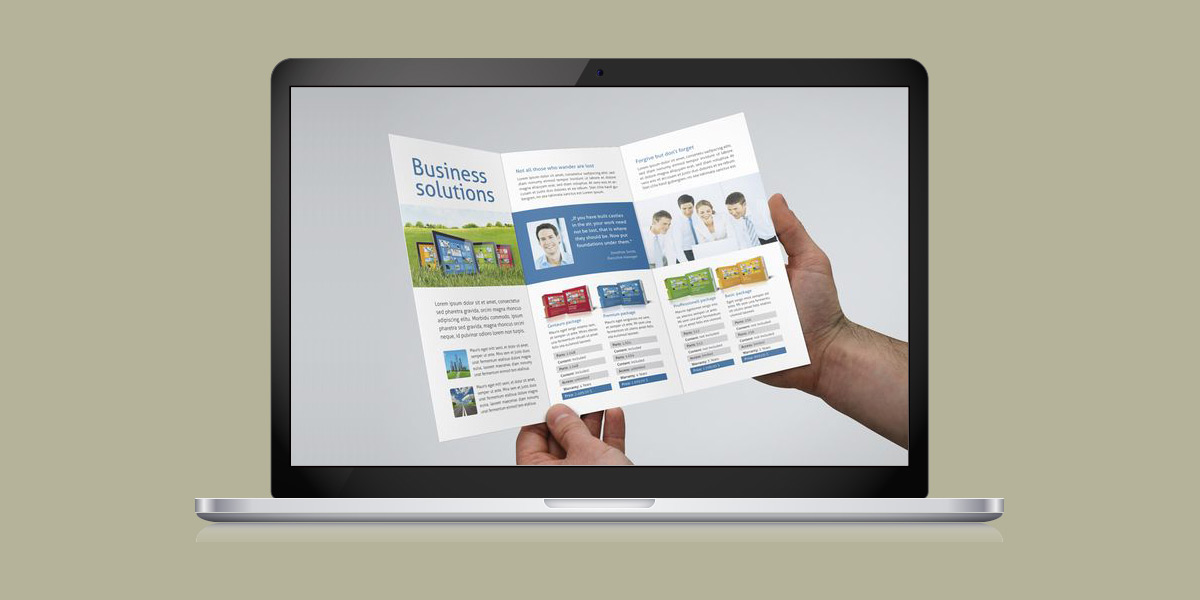
A brochure website is a reflection of the early Internet (2000ish). It typically stems from the mindset that simply having an online footprint is enough to meet a company’s marketing goals. They’re extremely light on features, lack engagement, and put an unhealthy emphasis on aesthetics to drive its success.
Unfortunately, brochure websites — especially if you’re an SMB — don’t work anymore. The websites that win today understand it takes more than just a basic website with a pretty interface (e.g. one antithesis of a basic website is a lead generation website).
Let’s unfold (see what I did there?) the 5 issues with brochure websites.
Issue #1: Brochure websites are nearly impossible to measure ROI
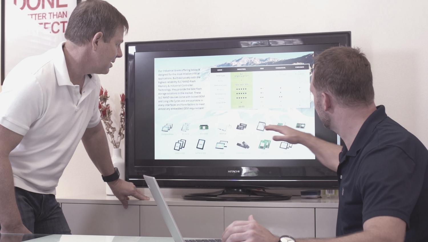
Our client Cactus Technologies created enough leads (that then turned into sales) to exceed their original website investment — in just 5 months after launch!
How did Cactus know that? How could they calculate that positive ROI?
From the initial launch Cactus had their calls to action, data and reporting singing harmony. Brochure websites overlook these essentials and consequently have no accurate way of measuring their website’s ROI.
“We don’t know how to measure our website’s ROI” is never a comment that a business owner or C-level executive wants to hear from marketing.

Issue #2: Brochure websites don’t impress Google
Can a brochure website rank for a keyword in Google? Sure. Will it significantly limit its opportunities? Absolutely.
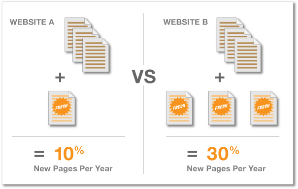
Google makes it very clear that creating valuable content regularly is critical to their algorithm. Websites that commit themselves to new or “fresh” content gain favor to the search engine that generates over 1.2 trillion searches a year (that’s 3.5 billion a DAY).
Brochure websites have no plan for adding content regularly, and consequentially put a ceiling on keyword rankings, organic traffic, and ability to generate links naturally (which is also critical to Google’s algorithm).
Issue #3: Brochure websites have a single (and ridiculous) measure of success
Which website below has properly identified its measures of success?
Website A:
- Double organic search traffic in 1 year
- Increase opt-ins to newsletter by 25% in 6 months
- Generate 10 prospect inquiries a month
- Increase conversion rate by 1%
Website B:
- Ensure our prospects and customers are impressed with our “eye-popping” design
Here’s the disconnect for those stakeholders. Today’s website should be backed by a impressive professional design — it’s the norm, not the exception.
Brochure websites forget about setting business impacting goals because their stakeholders become infatuated with aesthetics.
Issue #4: Brochure websites are more about the company than helping its audience
I’ve heard people also call a brochure website an “informational website.”
Informational for WHO exactly?
Most websites understand they should provide services/products information, company information, and contact information. However, brochure or “informational” websites will come to a screeching halt after they cover those basics.
A brochure website’s content fails to:
- Engage, Educate, be Effective, Entertain & Encourage action (Five E’s of Content Marketing)
- Follow the 80/20 content rule (80% helpful to audience, 20% promotional)
When a website fills itself up with sales and promotional informational, it just feels like one big sales pitch. No one likes to be sold, but everyone likes to buy!
Issue #5: Brochure websites don’t scale well

Since brochure websites have a myopic “here and now” perspective, they don’t see into the future and plan for how the website will grow over time. Because of this, they typically face structural issues early and often.
High performing websites grow over time. They add new functionality and content. Ideas are tested and measured. They expand and contract. Without fluid architecture, you’re simply left with a fragile card pyramid.
More: How to Improve a Website
For the record, I still don’t know what “eye-popping” means
As you might have guessed, ProtoFuse didn’t win the business of that investment firm. I checked on their website many months after our meeting and did take notice of their newly launched one.
As expected, it was your prototypical brochure website. I’m sure initially it made them happy until the honeymoon of glitz and glamour passed. My guess is the firm’s leadership felt the squeeze of more practical needs within three short months. Or, maybe not. Ignorance can certainly be bliss.
Furthermore, if anyone can explain what an “eye-popping” website is, please enlighten. 🙂
Need website help?

We're all about websites — especially websites that are loved by people and Google.
Since 2001, we've been helping clients nationwide turnaround their outdated and under-performing websites.

"Our website is generating quality leads every week thanks to their website consulting."
Steve L.
Cactus Technologies
Hey, you made it!
There is gobs of information available today — I'm honored you found this article interesting enough to make it here. I hope this insight leads you to a better-performing website!


About the Author
Eric Sharp is the founder of ProtoFuse and has been in the website trenches since 1999 — right before the dot-com boom redefined the website landscape. Since then, he's accumulated 25 years of digital marketing experience and prides himself on creating websites "Loved by people and Google". Outside of websites, it's all about fam time with his wife and 3 kids. He enjoys CrossFit, cooking steak on his cast iron skillet, collecting Jordan sports cards, and Daaa Bears.


