Website Mood Board: What is it? Why is it Important?
Updated last on:
March 30, 2023
What is a website mood board? How can they be effective in planning and designing your website? Hint: it’s more than just choosing colors and fonts, they are critical to nailing your website's visual design.

by Eric Sharp
TOPICS:
Quick Summary
Mood boards help people, both professional and non-professional, communicate visual ideas and facilitate creative conversations. Though they are not exclusive to the web design process, they can be used as a major tool to help align a company's branding to their website's look and feel. They allow visual designers to explore color palettes, fonts, photography/illustration style, iconography, navigation style, spatial awareness, and contrast. Separating the process of determining a website's look and feel from architecture, prototyping, or content activities, can reap big benefits in the overall website design process. Though mood boards are not the final design, they set up your website's overall UX for success.
Intro to website mood boards
Website mood boards are essential for ensuring your website nails its user experience.
But, what are they? How are they different than a mood board used by interior decorators and other professionals trying to communicate ideas visually?
Let’s first define the standard mood board, and then move on to explaining website-specific mood boards.
What is a mood board?
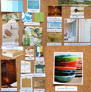
Though website professionals heavily use mood boards, they are not exclusive to our industry nor did they originate from it.
Mood boards have a long history of helping people communicate creative ideas and can take on many forms (actual or virtual) in various industries (e.g. fashion, interior design).
Wikipedia describes a mood board as:
A type of collage that may consist of images, text, and samples of objects in a composition of the choice of the mood board creator. Designers and others use mood boards to develop their design concepts and to communicate to other members of the design team.
To me, the critical word in this above description is communicate. Mood boards help communicate concepts. Mood boards in the web design process are no different.
What is a website mood board?
Mood boards for web design will focus on a specific set of elements to help communicate how the website’s content and overall user interface would be impacted.
The end format is typically a high-resolution image, showing elements of your website’s UI (user interface), font pairing, color combinations, and more.
What to include in a website mood board?
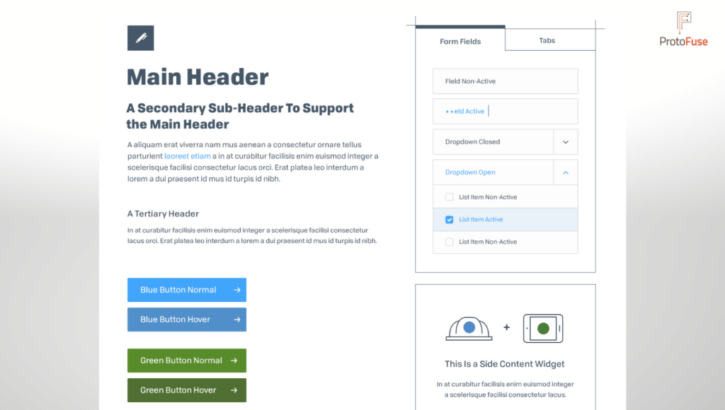
Website mood boards can range in complexity depending on the level of engagement, but typically website mood boards will experiment and showcase the styling of the following website elements:
- color palette
- fonts (typically 2, showing how they “pair” together)
- photography/illustration style
- iconography
- menu/navigation style
- spatial awareness (or, white space usage)
- overall contrast (helps emphasize hierarchy & structure)
Examples of website moodboards
Complexity and richness of a website moodboard will depend on the depth of your engagement with your web design team. We’ve seen the business case for needing low fidelity, and also a higher fidelity moodboard — sometimes teams need greater detail during the creative process.
Below are a few examples of website moodboards.
High Fidelity
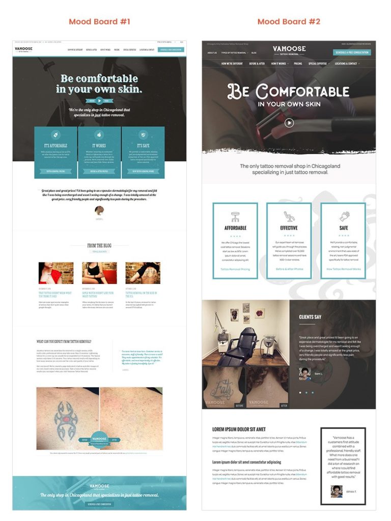
Low Fidelity
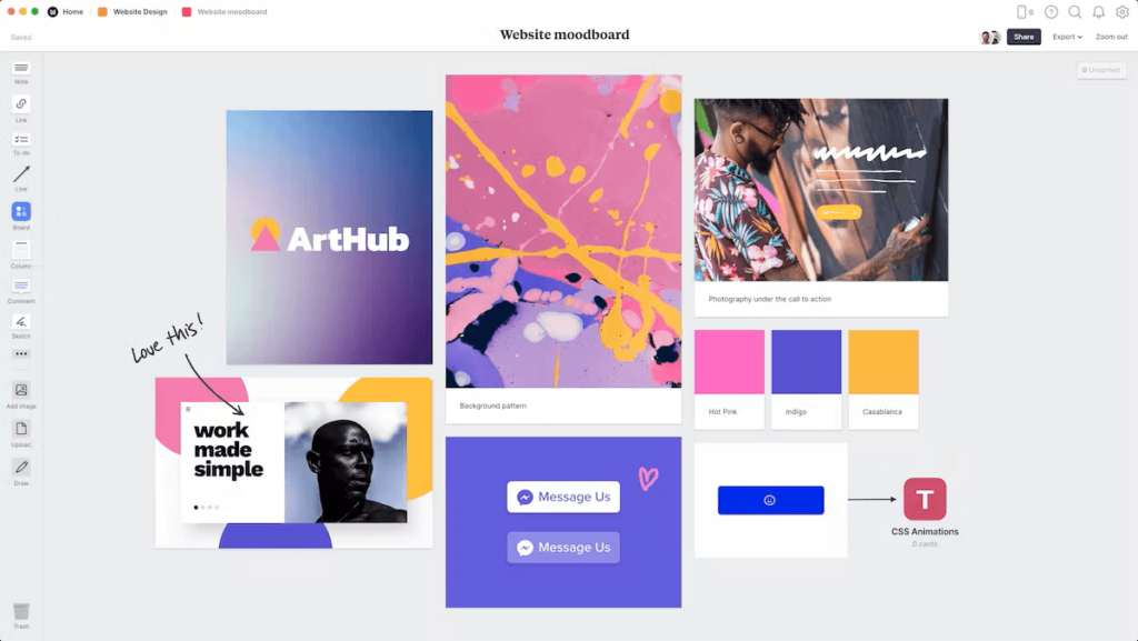
Why use a website mood board?
While designing your website’s user experience, a mood board will be an essential tool for helping everyone understand your organization’s:
- Branding guideline
- Communication style
- Personality
This creative process also provides designers with a golden opportunity to experiment with the articulation of your value proposition and positioning statement (more on that below) — critical elements to ensuring your message resonates with your audience.

Furthermore, when mood boards solicit the proper feedback and are presented in parallel with a clickable prototype, we believe they can erase that inescapable anxiety that the creative process can evoke.
Much more than “choosing some fonts and colors”
In his co-authored book Smashing Book #3, Aaron Walter, Director of UX at MailChimp, suggests that expressing your company’s personality in your design can:
- Help you distinguish yourself from your competitors
- Elicit an emotional response that encourages long-term memory of your brand
Communication style and personality help craft the overall experience your users will encounter throughout your website, and mood boards are the vehicle your organization can use to define those characteristics. This helps your website avoid being generic, dull, and uninspiring!
What website mood boards do not communicate
To understand their intent, it’s just as important to understand what they do not represent. Website mood boards do not communicate things such as:
- Specific page template design (e.g. Homepage design, About Us, Products) — mood boards are page template agnostic
- Final content (headlines, body text, image selections)
- Final site hierarchy (mapping a website is a different competency of UX)
- User interactivity
Communication style and personality help craft the overall experience your users will encounter throughout your website, and mood boards are the vehicle your organization can use to define those characteristics.
Not the Final Design
Website mood boards aid in the UX design process, but they’re not the final design.
Design isn’t just a particular phase or step to building a website, design encompasses everything. Your website strategy is design. Your prototype is design. How you’ll market your website to your ideal customer is (you guessed it), design.
Once this is understood, it’s much easier to review creative deliverables, provide feedback, and move toward launching your website.
3 opportunities website moodboards present
Now that you have an understanding of website moodboards, what they communicate (and don’t!), and why you should them in planning your website’s UX — let’s explore the opportunities they present during your UX planning.
Opportunity #1: Brand personality
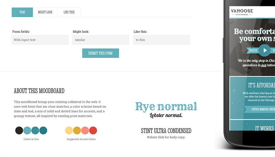
After your organization selects a mood board (we’ve found delivering clients two or three is best), it’s important to not overlook the significance of the decision.
Though you may have rationalized that you’re simply choosing a mood board that best adheres to your branding guideline and resonates more adequately with your audience, you’re actually defining the personality and communication style of your website — which should mirror your organization’s.
Opportunity #2: Value prop, positioning statement
In a medium full of noise and distraction, it’s becoming progressively harder to communicate:
- What you do
- Who you do it for
- Why you do it better than your competition
Before a designer can begin experimenting with how exactly your value proposition and positioning statement is woven into your website — you need to define them.
“You have to present your value proposition as the first thing the visitors see on your home page, but should be visible in all major entry points of the site“, states Peep Laja of ConversionXL.
Mood boards provide an excellent opportunity to experiment with the layout and styling of these two vital elements.


There’s also a case to be made that designers — by nature being creative and by proximity not being too close to your organization — can help you think differently about how these elements are conveyed. Many times we’ve helped our clients find the right “voice” via our mood boarding phase.
Opportunity #3: Decrease everyone’s creative anxiety
Mood boards make the uncomfortable, comfortable.
What is it about the creative profession that can spawn anxiety and put everyone on edge before or during a presentation? Is it the subjective nature of “design”? Is it the fear that the designer might miss the mark?
We better like it!Your Inner Voice
I’ve talked extensively about how mood boards can impact your website’s user experience, but what about you?
Does your organization have experience with the creative website process? Can mood boards ease the anxiety that you may experience with a web designer?
We think so. In fact, we see it time and time again in our engagements.
Final Thoughts
The success of your website hinges on much more than just choosing the right mood board.
With that said, mood boards are a powerful tool that can help your website:
- follow established branding guidelines
- set the right tone, communication style, and personality
- experiment with the styling of your value proposition & positioning statement
- silence your organization’s inner voice before that creative anxiety rears its ugly head
Happy mood boarding!
Need website help?

We're all about websites — especially websites that are loved by people and Google.
Since 2001, we've been helping clients nationwide turnaround their outdated and under-performing websites.

"Our website is generating quality leads every week thanks to their website consulting."
Steve L.
Cactus Technologies
Hey, you made it!
There is gobs of information available today — I'm honored you found this article interesting enough to make it here. I hope this insight leads you to a better-performing website!

About the Author
Eric Sharp is the founder of ProtoFuse and has been in the website trenches since 1999 — right before the dot-com boom redefined the website landscape. Since then, he's accumulated 25 years of digital marketing experience and prides himself on creating websites "Loved by people and Google". Outside of websites, it's all about fam time with his wife and 3 kids. He enjoys CrossFit, cooking steak on his cast iron skillet, collecting Jordan sports cards, and Daaa Bears.


