4 Simple Words to Avoid on Your Website
Updated last on:
April 13, 2022
Words matter. Especially when you don’t use the right ones. Avoid, remove, or rewrite these 4 words on your website to provide your visitors with better UX and boost your conversion.

by Eric Sharp
TOPICS:
Content • Conversion • UX
Websites = vehicles of content
We all forget at times that websites are vehicles of content.
Amongst the beautiful imagery, animated interfaces, and vibrant colors there are words. These words will either keep people on your website or convince them to leave.
Obviously, words are found in your content, but they’re also in your website’s menu system, links, buttons, and calls to action. Words describe your service or product, answer questions, and inspire people to fill out forms, order, download or opt-in.
Words matter. Especially when you don’t use the right ones.
Here are 4 words you should avoid, remove or rewrite on your website to provide your visitors with a better overall user experience and give your conversion a boost.
1. Learn More
We’ve all made this lazy decision. There’s some content on your website — such as a paragraph or image — and you’re trying to encourage a user to click further into the site. So, we casually drop in a ‘Learn More’ link or button beneath it all. And move on. Simple solution, right? Wrong.
This word choice degrades the user experience. Nielsen Norman agrees that we can do better than ‘Learn More’ links:
The phrase ‘Learn More’ is increasingly used as a crutch for link labels. But the text has poor information scent and is bad for accessibility.
I’ll add “bad for SEO” too because it doesn’t pass link juice (the power or equity passed to a page via this internal link) — a common SEO mistake.
Let’s visualize this to illustrate the issues with ‘Learn More’.
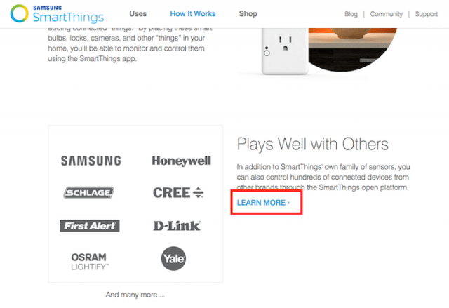
The better options here would have been:
- More About SmartThings’ Sensors
- See All Supported Devices
See the clarity this brings? (As opposed to wondering what page you’ll be clicking to). Putting in the extra effort to rename Learn More to something more descriptive is better for UX.
Now, it begs to question if Learn More links can be used at all. They can. “If the text that precedes the link makes it obvious what’s to come, then a ‘Learn More’ label isn’t devastating to the user experience” is one option, says Nielsen Norman.
Here’s my recommendation: scrutinize the use of ‘Learn More’ links everywhere on your site to ensure clarity.
2. Click here
Tell me if this conversation sounds familiar:
We need to make it clear and obvious for a user to click this button or link. Let’s just say ‘Click Here’.

Of course. Clarity, simplicity, context — all good things for website usability. However, using the words ‘Click Here’ is counterintuitive to making it “clear and obvious for a user”.
Your links should never say ‘Click Here’ because:
- It takes the user’s attention away from your interface and on to their mouse.
- Conceals what the user is clicking. They’re forced to read the words around the link, causing delay.
- You can make the user feel dumb. Who doesn’t know what a link is or how to click it?
“The challenge is to make your links say ‘click here’ without actually saying ‘click here’,” states UX Movement.
3. Submit
We’re all skeptics when it comes to filling out forms:
- “Are they going to start spamming me?”
- “Is this company going to abuse my data?”
When a form ends with a big ol’ ‘SUBMIT’ button, it’s a harsh reminder of this skepticism.
‘Submit’ makes the experience feel like a one-way transaction, rather than an opportunity for give and receive.
‘Submit’ also impacts conversion rate. Unbounce found that using the word “Submit” on landing pages decreases conversion by 3%. Can one word do that? You bet.
If that theory is even halfway accurate, you’re still improving by 1.5% if you change a single word! If anything, it’s, at least, a theory you can test on your website. The results may surprise you. There are plenty of ways to avoid using ’Submit’ on forms.
Here are a few samples from our clients’ websites:
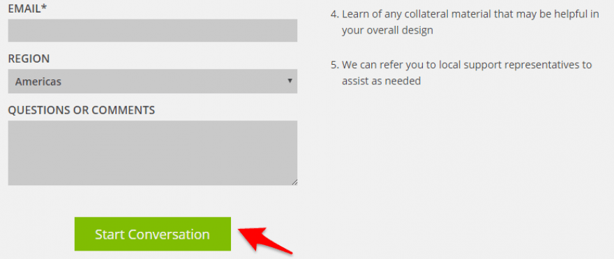
Example 1: Cactus Technologies
On their ‘Talk to an Expert’ lead gen form, the words indicate what happens next:
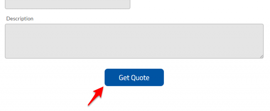
Example 2: Revere Electric
They could have easily labeled their button ‘Submit Quote’, but merely exchanging with ‘Get Quote’ helps remind the user they’re getting something in return:
Example 3: Carefree Communities
Using ‘Book Now’ rather than ‘Submit Reservation’ helps the customer understand, specifically, what the button does:
Example 4: Amazon
Amazon is not a client (yet), but proof even the big boys avoid ‘Submit’. Amazon’s checkout chooses words that are more actionable:

4. Your
This one took a while to click. Pun very much intended.
Though I’ve researched, written about, and tested conversion methods for 5 years, I was late to the game on using the right pronouns on calls to action. Which was a big deal because pronouns affect conversion rate.
Let’s say your website was giving away something. How would you word your call to action?
- GET YOUR FREE GIFT
- GET MY FREE GIFT
If you said #2, congratulations on a higher conversation rate. SiteTuners explains the psychology of “MY”:
When a person feels personally connected to a product or service, they buy, according to Entrepreneur and others. That’s not always easy to achieve on the Internet, where your sales copy and products compete with thousands and thousands of other sites. The simple use of “me,” “my” and “mine” helps to avoid that.
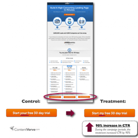
Simple word changes will produce better website results
For those thinking “Really Eric? Avoiding a few words on my website will make a difference?”
Yes. Absolutely. 100%. No doubt.
Still don’t believe me? Remove these 4 words on your website and see if engagement and conversion spike. I think you’ll be pleasantly surprised.

I tend to use a gardening analogy when it comes to improving a website — especially these days as I just completed the Whole30 Program.
A garden that produces is a garden that is nurtured. To produce a crop, it needs water, fertilizer, plenty of sun and weeded. However, one little beetle or caterpillar will ruin the whole garden. Initially, the pest seems small and inconsequential, but it’ll destroy if you give it enough time.
Similarly, a single word could ruin your website’s experience. It may not destroy it, but it’s certainly preventing a big crop. Don’t underestimate the power of words, as harmless as they may seem.
If you avoid these 4 words on your website, you’ll see better UX, conversion & overall engagement.
Now click here for more info. 🙂
Need website help?

We're all about websites — especially websites that are loved by people and Google.
Since 2001, we've been helping clients nationwide turnaround their outdated and under-performing websites.

"Our website is generating quality leads every week thanks to their website consulting."
Steve L.
Cactus Technologies
Hey, you made it!
There is gobs of information available today — I'm honored you found this article interesting enough to make it here. I hope this insight leads you to a better-performing website!


About the Author
Eric Sharp is the founder of ProtoFuse and has been in the website trenches since 1999 — right before the dot-com boom redefined the website landscape. Since then, he's accumulated 25 years of digital marketing experience and prides himself on creating websites "Loved by people and Google". Outside of websites, it's all about fam time with his wife and 3 kids. He enjoys CrossFit, cooking steak on his cast iron skillet, collecting Jordan sports cards, and Daaa Bears.

