How to Improve Your Website in 12 Practical Ways
Updated last on:
March 2, 2023
Looking for easy-to-understand, actionable tips to improve your website? These 12 practical ways will detail more than the typical generic advice you hear.

by Eric Sharp
TOPICS:
Quick Summary
Most website improvement ideas are too vanilla and come in multiple shades of gray. This list is not that. The ultimate goals of improving your website are better traffic (not just more), increased sales/leads, and higher efficiency — the key metrics for a solid ROI. These 12 specific ideas are categorized into four topics: 1) Research, Data 2) Conversion 3) Content, Google Friendliness, and 4) Maintenance, Functionality.
Table of Contents
Research, Data
1. Document User Personas
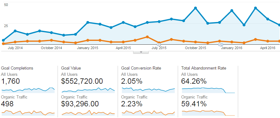
2. Google Analytics Goals
Conversion
3. Value Prop
4. Site-wide CTA
5. Add/Edit/Remove Landing Pages
6. Simplify Conversion Forms
Content, Google-friendliness
7. Fine-tune SEO key pages
8. Fix Bad Grammar, Typos
9. Answer 100 questions
10. Mobile Friendly
Maintenance, Functionality
Need website improvement? Not sure where to begin?
I don’t know about you, but I’m mildly annoyed with all the boilerplate advice that many “experts” suggest because it’s generic and not actionable.
Tips like:
- Improve Conversion Rate!
- Increase Traffic!
- Have a better Design!
Yes. But, how exactly?
Most of us understand these big picture concepts in theory. However, concepts don’t improve a website — practical, specific, and actionable ideas will. Below are 12 easy-to-understand tips that’ll inspire and show you how to take action. Each one hits on a different area of website improvement.
If you do all 12, you’ll dramatically change your website for the better. If you do just one, you’ll still be making headway and will see measurable progress.
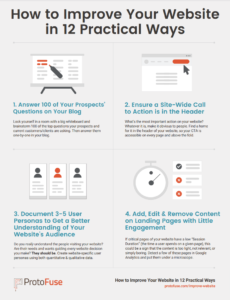
12 website improvement ideas spanning various aspects

I’m not just going to focus on conversion. Or design. Or SEO. These 12 tips will cover these major areas (listed in no specific order):
- Conversion
- Content
- Research
- Maintenance
- Mobile
- Usability
- SEO
- Measurement
- Design
Now, let’s explore each of these 12 practical tips and how you can turn them into actionable to-do’s to improve your website.
1. Document 3-5 user personas to get a better understanding of your website’s audience
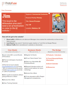
Do you really understand the people visiting your website? Are their needs and wants guiding every website decision you make?
They should be.
People assume their website’s users think and act like they do.Steve Mulder, The User is Always Right
Documenting website user personas won’t have an immediate impact on your site, but they’ll improve your website in every way over the long-haul because you’re crafting an experience for them (not yourself). Create them from website research using quantitative and qualitative data.
2. Set up Goals in Google Analytics
If you can’t measure it, you can’t improve it.Peter Drucker
Mr. Drucker loved measurement. If he were still alive, he’d revel in using Google Analytics goals data to improve his website.
Are you tracking website conversions in Google Analytics? If not, it starts with setting up “Goals”. Here’s Google’s guide to configuring goals.
Taking a data-driven approach to understanding how your website is converting is a scientific way to improving a website. But, it begins with goals!
3. Redesign homepage to communicate your Value Prop
Your homepage is one of the most critical pages of your site. Not because it’ll get the most traffic (most sites get more traffic to other pages), but because:
- It provides a bird’s eye view of our company
- It’s your website’s “reset” button
Your company’s value proposition should show on your website. If you haven’t documented your value proposition, start there. Then follow ConversionXL’s formula and put it front and center on your homepage:
- Headline. What is the end-benefit you’re offering, in 1 short sentence. Can mention the product and/or the customer. Attention grabber.
- Sub-headline or a 2-3 sentence paragraph. A specific explanation of what you do/offer, for whom and why is it useful.
- 3 bullet points. List the key benefits or features.
- Visual. Images communicate much faster than words. Show the product, the hero shot or an image reinforcing your main message.
Improving the articulation of your value prop will boost your website’s clarity. And clarity can’t be underestimated in today’s noisy world.
4. Ensure a site-wide Call to Action is in the header
What’s the most important action on your website? Is it filling out a lead generation form? Downloading a lead magnet? Buying a product?
Whatever the action, you need to make it obvious for people. More specifically, you need to find a home for it in the header of your website, so your CTA is:
- Accessible on every page
- Above the fold (giving the prominence & attention it needs)
Follow the 4 C’s with your website call to action to help you design an effective CTA.


5. Add/Edit/Remove content on landing pages with little engagement
Conversion Optimization experts L-O-V-E this tactic.
Why? Because it’s plugging leaky holes on your website.
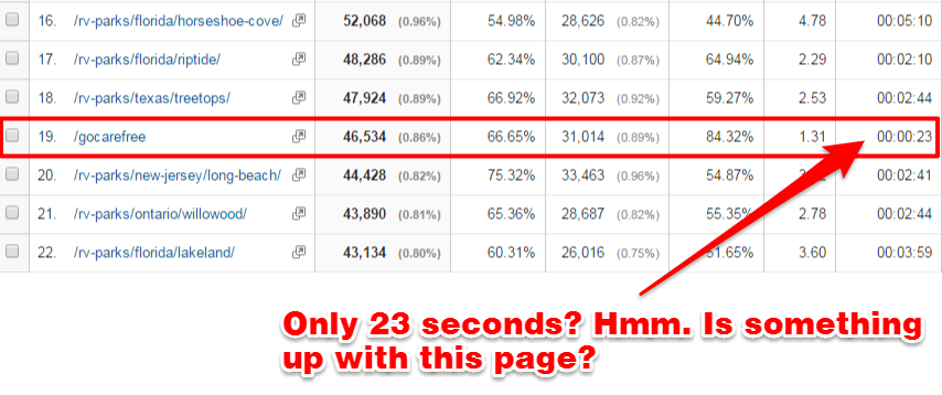
If critical pages of your website have a low “Session Duration” (the minutes & seconds a user spends on a given page), this could be a sign that the content is:
- Too light
- Not relevant
- BORING
Detect 5-10 of these pages in Google Analytics and put them under a microscope. Is the content helpful? Does it need some TLC? Does it need blown up and re-written?
6. Simplify conversion forms, add specifics, drop in “click triggers”
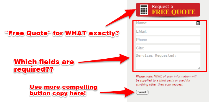
Conversion forms, when done right, are a mixture of both art and science. When designed well, they make it smooth as butter for those wanting to fill out the form — and inspire those who are on the fence. This topic (conversion rate optimization) is loaded with best practices, strategies, and tactics.
For this article, here are the 4 most practical ways to quickly improve your website’s forms:
- Limit the number of required fields. The less options you present, the lower the friction.
- Add “click triggers”. These are extra boosts around a button to convince more people to click it (e.g. testimonial, star ratings, privacy messaging, guarantees, etc.)
- Avoid certain words on buttons (such as “Submit”). More about not using certain words on your website
- Explain clearly what happens NEXT. Email confirmation? A sales rep will call them 1-2 business days? They’ll receive message in a bottle?
7. Fine-tune your SEO on high authority pages
You can improve your website’s Search Engine Optimization in 30 minutes. It just takes a little data extraction and some sharp copywriting.
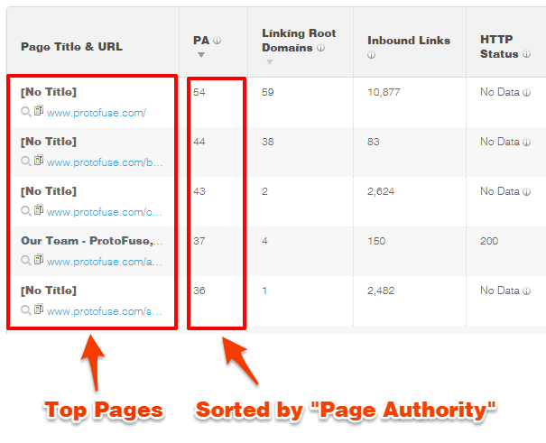
- Step 1: Get your “Top Pages” by authority using a tool like OpenSiteExplorer.com (free version reveals your top 5) or Ahrefs.com (free account reveals your top 20).
- Step 2: Inspect those page’s Meta Titles and Meta Descriptions and ensure they don’t wrap (your Content Management System has this data)

These three simple steps, applied to each of your top pages, will not only improve the on-page optimization but will inspire more people to click over to your website.
Pro tip: Use this Snippet Optimization Tool to visually see your Meta Data as you write it.
8. Fix Bad Grammar/Typos

Don’t snicker. You’d be surprised how little details like misspellings and typos impact a website in big ways.
Typos will damage your website’s credibility. It’ll also impact your bottom line and could cost you money.
Don’t let simple oversights, that are easy to fix, hold back your website. You’ll improve your website and your bottom line with some proofing and editing. Hire a freelancer editor or roll up your sleeves yourself and fix these credibility killers!
9. Answer 100 of your prospects’ questions on your Blog
I learned this tactic from the super smart Marcus Sheridan at The Sales Lion.
Marcus suggests locking yourself in a room with a big whiteboard and brainstorming 100 of the top questions your prospects are asking. Then answer them one-by-one in your blog.
Within a few hours, you’ll have 100 blog ideas!

Whenever I feel a client getting overwhelmed with their Content Marketing strategy, I dumb it down and pass this concept along. And it works every single time because it’s so easy to understand. Adding valuable content to your blog that answers your potential customers’ questions will dramatically improve your website. It’ll make your company more trustworthy and transparent, but also drive more traffic and improve conversion rate!
Still not convinced you need a blog? Read this: 3 Simple Reasons to Start a Blog.
Pro tip: don’t forget to digitize that whiteboard brainstorm, try one of these idea organizer apps and software tools.
10. Make it Mobile-Friendly
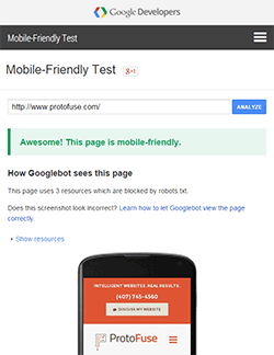
Already mobile-friendly? Great. But, you may want to double check with Google’s mobile-friendly test.
I’ve had a few conversations, just this year, where the person thought their website was mobile-friendly, and then I become the bearer of bad news. Not fun.
I’m sure you know by now that your website needs to be mobile-friendly.
If you’re not mobile-friendly, you have 3 options:
- Create a separate mobile version (example: mobile.website.com)
- Use mobile plugins (if you’re running a popular CMS platform, like WordPress)
- Convert website to RWD (“Responsive Web Design”)
This improvement isn’t the cheapest or quickest to implement, but should be near the top of your list.
11. Fix browser-specific issues
Imagine that your visitors couldn’t click your website’s call to action. Or your lead generation form doesn’t show all the right fields. Or your navigation menu is missing a section.
Imagine that your visitors couldn’t click your website’s call to action.
These are all very real situations (that I’ve seen firsthand) that surface when a website has browser-specific bugs from lack of browser planning and/or testing. What many website owners forget is that not everybody uses the same browser.
The 4 most popular browsers you should test your website in:
- Chrome
- Safari
- Firefox
- Edge
And if you have the budget and feel it’s necessary, also test in:
- Samsung Internet
- Opera
So, how do you get detect these errors and fix them? Start with Google Analytics and view this report: [Audience > Technology > Browser & OS].
You’ll see something like this (I prefer the Pie Graph):
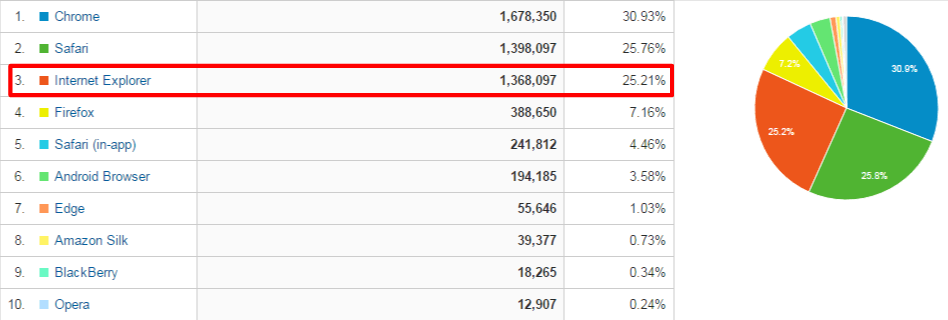
Once you get a snapshot of your browser distribution, it’s time to test run your website in the most popular browsers by either:
- Installing the browser on your computer
- Using a service like BrowserStack.com (plans start at $29/month)
Fixing common website issues, like browser bugs, is certainly not a sexy website improvement to get excited about, but it needs to be addressed.
12. Run User Testing on your website’s core functions

Many people let User Testing (aka Usability Testing) intimidate them. They think you need thousands of dollars, your own testing lab, and a data scientist to spearhead the whole thing.
Don’t overthink this.
There are plenty of useful services available today (like UserTesting.com) that’ll help you set up a usability test within 24 hours for under $100. Selling a product? Run a test on the ordering process. Offering a service? Run a test on finding specific pages and inquiring more information.
The results will help you improve your website’s core functionality and translate into a higher conversion rate!
Start improving your website today!
Don’t let this list overwhelm you. Start with one, complete, and move onto the next. Website improvement is all about incremental changes and measurement.
Need website help?

We're all about websites — especially websites that are loved by people and Google.
Since 2001, we've been helping clients nationwide turnaround their outdated and under-performing websites.

"Our website is generating quality leads every week thanks to their website consulting."
Steve L.
Cactus Technologies
Hey, you made it!
There is gobs of information available today — I'm honored you found this article interesting enough to make it here. I hope this insight leads you to a better-performing website!


About the Author
Eric Sharp is the founder of ProtoFuse and has been in the website trenches since 1999 — right before the dot-com boom redefined the website landscape. Since then, he's accumulated 25 years of digital marketing experience and prides himself on creating websites "Loved by people and Google". Outside of websites, it's all about fam time with his wife and 2 kids. He enjoys CrossFit, cooking steak on his cast iron skillet, collecting Jordan sports cards, and Daaa Bears.

